|
Lit A.F. Game Design Newsletter #14
|
Lit A.F. Game Design Newsletter #11
|
Lit A.F. Game Design Newsletter #9
|
Lit A.F. Game Design Newsletter #7
|
Lit A.F. Game Design Newsletter #5
|
Lit A.F. Game Design Newsletter #3
|
Lit A.F. Games Design Newsletter #1
Hello Game Designers,
Welcome to the first edition of the Lit A.F. Game Design Newsletter!
My hope is for this newsletter to contain the best and most relevant information in the world of game design. Hopefully you find it useful :)
Let's get to it.
Here is what happened this week in game design.
Good Reads
How Smart Game Design Can Turn Ordinary People into Heroes
There's a lot we can pull from all types of gaming mediums. Escape rooms provide an especially interesting design space when it comes to cooperative play and puzzle design. In this article, both escape room designers and veteran players are interviewed about their experiences with this booming hobby.
From designer Scott Nicholson:
“You design challenges such that they require different types of skills. You set it up so that things have to be done simultaneously. You divide people by space and introduce elements of communication. Even just taking something that is normally small and making it very large can make it interesting.”
Listen Up
Humans Who Make Games - feat. Edmund McMillen (The Binding of Isaac)
This is a brand new podcast hosted by Adam Conover (from Adam Ruins Everything). Adam interviews Edmund McMillen of Super Meat Boy and The Binding of Isaac fame. The discussion ranges from getting their start in their respective fields to more fine grain detail of Edmund's games.
I have a whole new perspective of Isaac after Edmund explained where the inspiration for the 'story' came from. I will refrain from spoiling it here. What was just as interesting in terms of design is Edmund's take on procedural generation. It doesn't have to be at the heart of your game. It's just another tool in your tool belt that can be used to enhance any feature (if it can be implemented appropriately).
FYI the beginning is all about Edmund's history. I do recommend it, but you can skip to 53:00 to just hear the game design discussion.
Watch and Learn
Rewards in Video Games
In this recently released 2017 GDC talk, Travis Day from Blizzard Entertainment discusses what he's learned about reward systems from working on games like World of Warcraft and Diablo 3.
This talk narrates the evolution of the design of those 2 titles. If you have a game with loot drops, this is a must watch video.
A quote from the topic of "Be Generous" to players:
"No design is perfect, we will always have problems to solve. It's better to solve the problem of players having everything they want than trying to solve the problems caused by players being frustrated with stingy reward systems."
Game Juice of the Week
Game: Dead Cells
Platform: PC, Mac, Linux, Xbox One, PS4, Switch
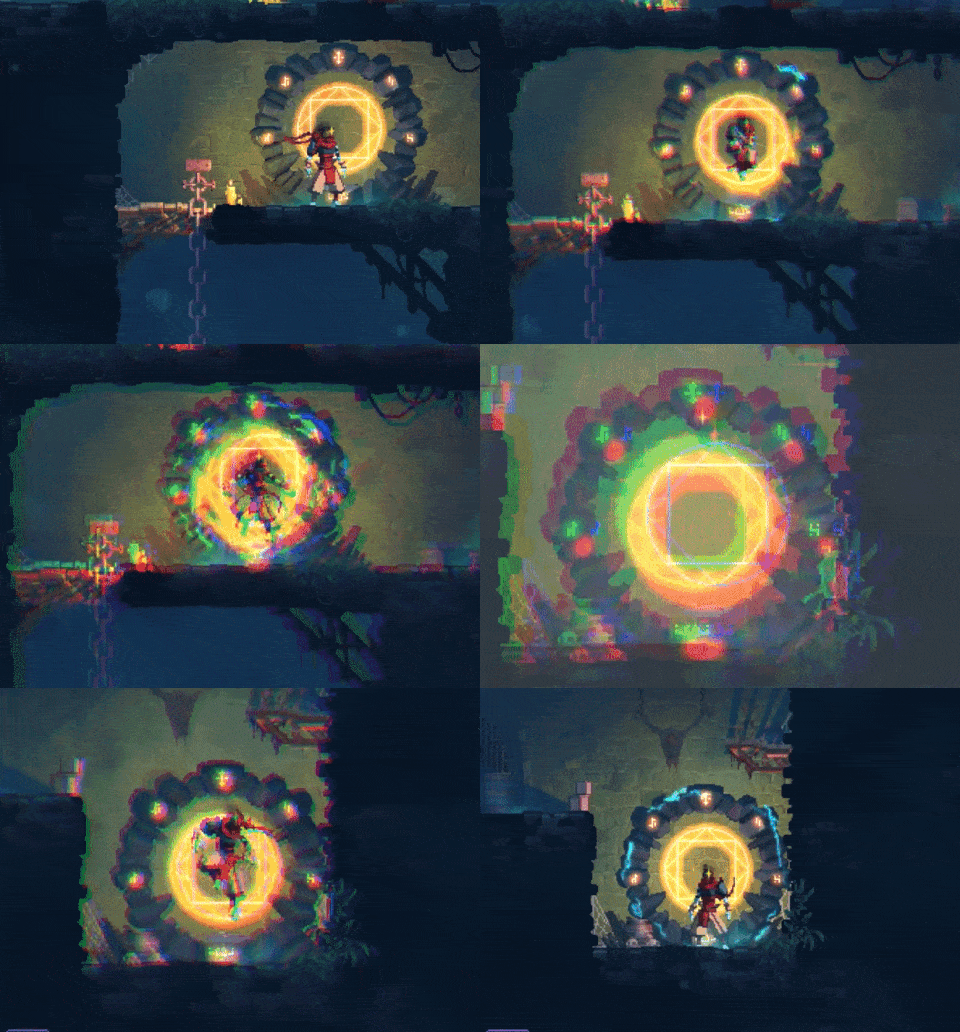
This is the fast travel system in Dead Cells. What I like about this animation is that it really feels like you are doing some crazy inter-dimensional magic to teleport from one point in space to another. There is a fabulous screen distorting shader while the character curls into a ball. Finally, a flash of light releases the tension and places you softly at your destination.
My one gripe is that the player just kind of appears out of nowhere. There should either be a cool animation or the character appears before the flash is over.
From the Archive
Game Design Concepts
In this section, we look at good resources for game designers from years past that are worth revisiting. It's not the latest info, but a lot of these resources contain tried and true game design concepts.
In this case, we have a free game design course from 2009 by Ian Schreiber. The material is still relevant and each 'class' has been written out in blog form. There's a full syllabus and recommended text to accompany the course.
If you're looking for some foundational material on game theory or just brushing up on game design then this course is a great starting point.
Thanks for reading!
- Olin
Have a comment, issue, or suggestion? Email us at olin@litafgames.com
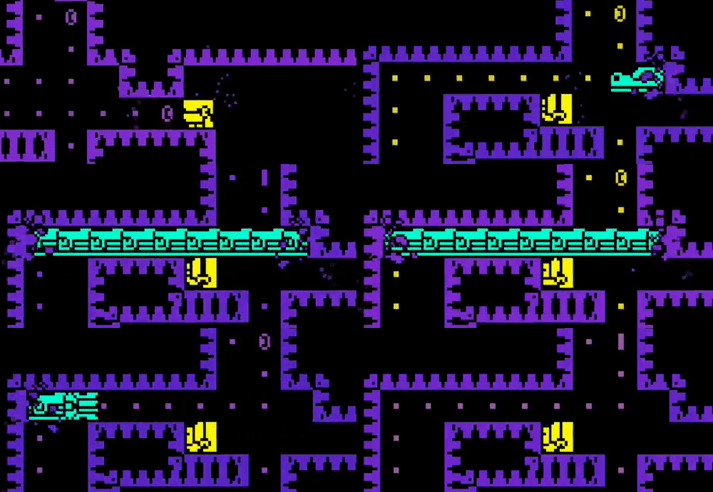
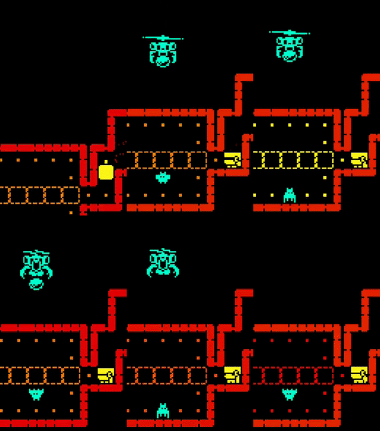
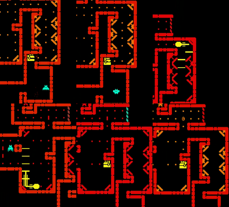
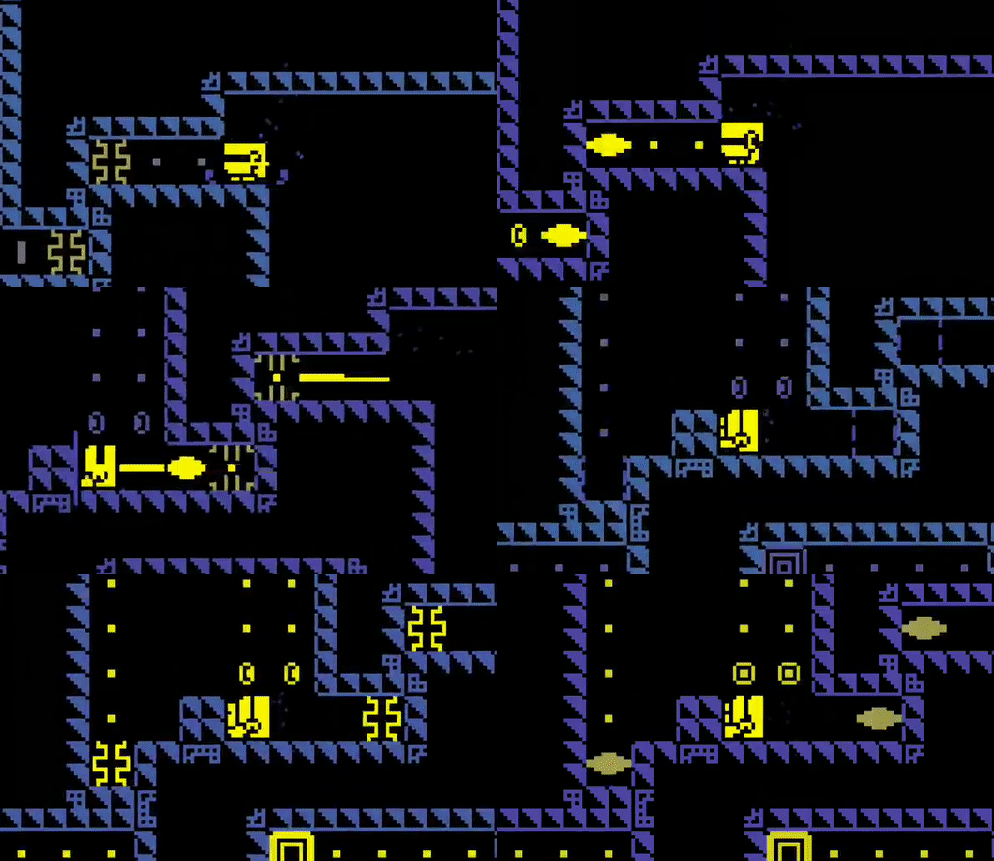
Tomb of the Mask: Enemy Analysis
Basics
Tomb of the mask has been at the top of the app store for a while. It's a game published by Playgendary, who have several chart topping apps.
The development team seems to be a single developer by the name of Shelzy, who worked with a small team of artists known as Happy Magenta. I like seeing developer-artist collaborations like this since it's the same team makeup as my own.
It's also encouraging to see a game made by a small team achieve success. Yes, they 'sold out' to a big publisher, but let's face it, that's required in today's mobile gaming market.
And it's well worth the attention because the game is fun, polished, and unique. It reminds me of pac-man as the player must collect dots and avoid enemies in maze like levels.
Of course the game is not limited to just one enemy type like pac-man and has many different powerups and levels layouts.
The controls are extremely well done and feel very native to mobile. No on-screen joystick or arrows. You swipe in the direction that you want to go. I am a fan of good native controls and this game nails that.
My only complaint about the controls is that sometimes my swipe is not registered which leads to death. Most of the time, I blame myself for trying to go too fast.
Mobile Features
If you're anything like me and play a variety of mobile games, then you are certainly aware of features that are consistent across the medium.
Usually a game implements a few of these, but this game seems to have every…single...one.
Level based gameplay AND infinite mode
Three star system for each level
Lives system to prevent binge gaming
Watch an ad to revive
3 Missions rewarding certain behavior
Player level system
Spin the wheel luck mini-game
Watch an ad to double your reward
Video reward ads for in game currency and power-ups
Skins with stats
Constantly asking you to subscribe, rate, and pay to remove ads
Changing colors of the environment every few levels to mix things up
I'm actually surprised and almost disappointed there isn't a daily reward.
I'm not going to go into each of those systems in detail as that would be way too much to take on. If you have played mobile games then you know the basics of how they work.
And I'm also not saying that it's good or bad that all of these are in the game. Plenty of people will be upset about some these mechanics while I could argue in favor of some of them.
But that's besides the point. In this article I want to talk about a couple aspects that I really enjoy.
Obstacles/Enemies
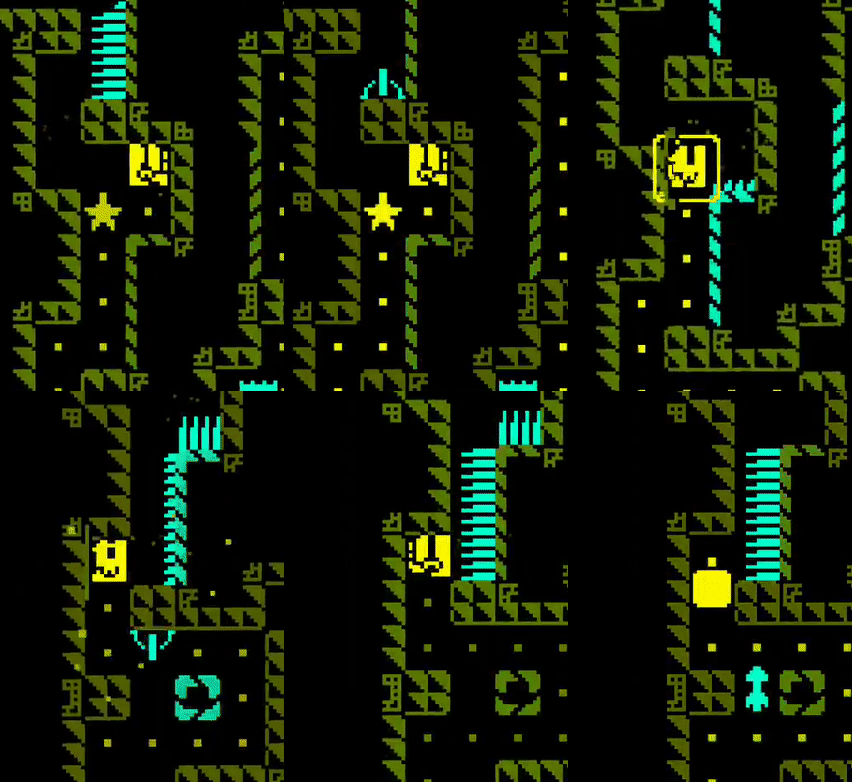
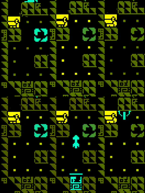
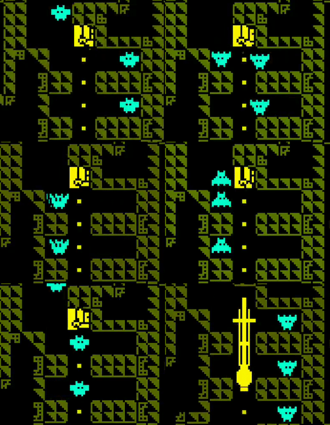
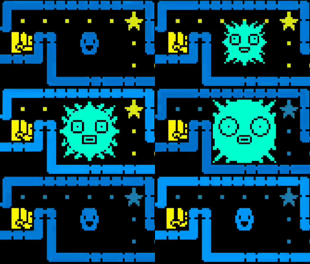
The piece of design I do want to deconstruct is the obstacles/enemies. Again, you swipe to move through this maze-like-tomb and collect dots. There are obstacles like spikes, bats, and flying arrows that kill you if you touch them.
Each mechanic is introduced to the player slowly over the course of different stages. The first stage in which the player encounters an obstacle will be fairly simple as the game teaches the player how to handle the danger. Then the game will mix that obstacle with the existing ones to make things more difficult and interesting.
Each obstacle is also unique in how it functions within the game. If the enemies are different, then so should their behavior. For example, there are bats and snakes in the game but both are dangerous in different ways.
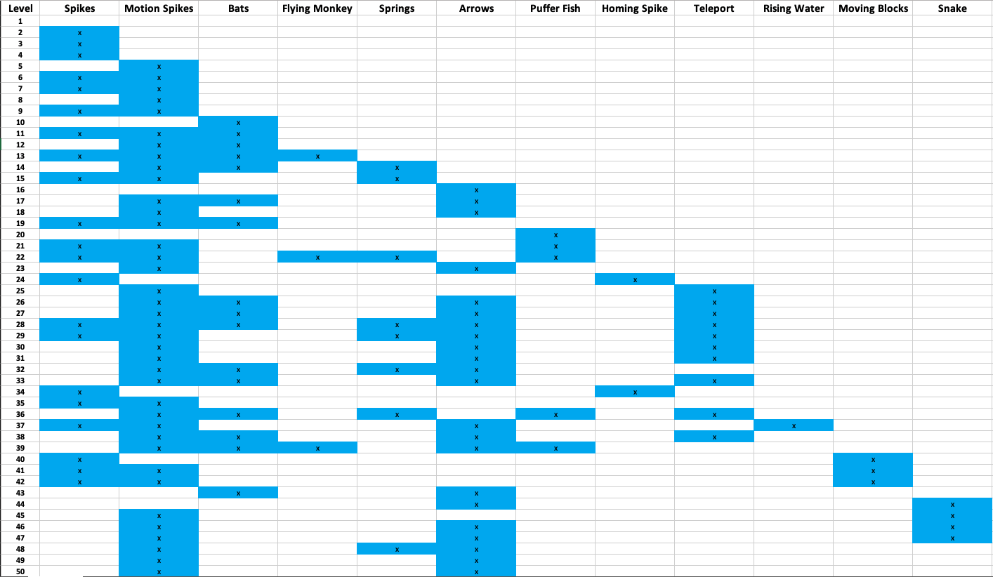
This table shows the obstacle distribution of the first 50 levels.
You will notice that the spikes triggered by motion detection are the most common obstacle. This is most likely due to their versatility and ease of implementation. They replace any wall and can easily kill the player if they are not paying attention.
I was actually surprised the regular spikes show up less often. The problem with regular spikes is that the player can never go on them. So they limit the movement of the player. They are used more as an occasional trap if you are trying to maneuver through the level a certain way.
The next most common is the flying arrow trap, followed closely by the bats. These represent the basic mid air obstacles and can be used in plenty of applications. It's important to note the distinction between the two. The bats are always there and move back and forth while the arrows move in one direction with a brief moment of non-existence. This non-existence enables them to be used in tunnels where a bat would be impassable.
There are some less common obstacles such as the puffer fish. I thought the puffer fish would be used a lot more once it was introduced. I can only guess that there is some aspect that makes these enemies less level design friendly, the designer just doesn't personally prefer to use them, or simply that they will be used more in later levels.
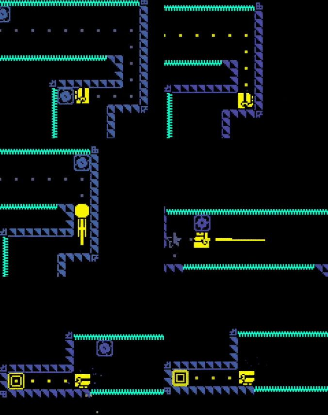
One of the coolest (yes, I did just use the word 'coolest') enemies is the snake. It does not have a predictable pattern (unless you repeat the level) and can appear anywhere in the level. A wall will flash momentarily before the snake comes busting out of the wall and goes straight through any other obstacles until it disappears. The rest of the level is tense as the snake could return at any moment.
The snake really feels like a boss type enemy. It's pattern is unpredictable and it is much larger than any of the other enemies.
For the rest of the enemies, I am going to give a more lightning round style explanation.
Flying monkeys that drop…coconuts? Like the snake, also unpredictable. Causes a sense of panic until you realize to just chill in a safe spot until they pass.
Homing spike thingys that, well, follow the player and kill them. Move quickly! I didn't make a gif of this one so boo to you.
Springs and teleporters that exist to alter movement. The teleporters enable crazy level layouts.
Moving blocks are likely paired with spikes. Slows the player down and forces them to make some timely jumps.
Game Modes
The last topic I'd like to cover is the difference between the 2 game modes: Stage Based Mode and Arcade (infinite) mode.
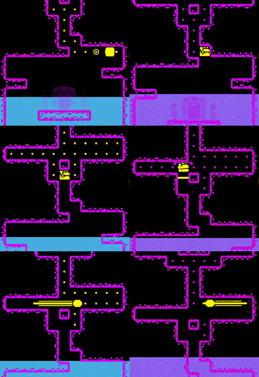
The key difference in these modes is that in infinite mode the player is pushed forward by way of a rising pool of water. If the player touches the water, they die.
This changes the design of these levels. In infinite mode, the end goal is always to go up. There is not much side winding around. The player will also not be able to get all the dots or coins. They can merely get as many as they can and then continue up.
In contrast, the stage based mode (while there are some levels with the rising water) has drastically differently designed levels. You can start in the bottom right of the level and wind your way around until you end in the middle. Sometimes the exit is right next to the entrance but you just can't reach it until you go through the whole level.
This sort of design is much more puzzle based. The player has time to think about each move they make, and so making the levels catered in this way makes sense. I spend time trying to figure out how to get each dot, not simply survive and escape the water.
Infinite mode favors fast reflexes while stage based mode favors logical thinking.
Infinite mode dots are points while stage based mode dots are currency for level bonuses.
I want to point out that I'm not saying one is better than the other. It's just that this one mechanic changes the design of the game. The player must change their play style depending on the mode even though the underlying mechanics are the exact same.
Conclusion
The well thought out introduction to obstacles is something to really take note of here. Every good game that has a multitude of mechanics will introduce them one at a time to the player.
I also love how the different modes create drastically different styles of gameplay. The development team has really taken a core set of mechanics and stretched them out to get as much playability out of them as possible.
I will say that one thing that got out of hand in this game is ads and pop ups for their subscription. I have no idea if this is what it was like when it first launched or if this was insisted on by the publisher, but it's pretty annoying.
Every time you open the app they ask if you want to subscribe for $8 per week for some in game bonuses. This really is only targeting the whales while just annoys the general player base. There's also a video ad between every level that you can't skip until about 10 seconds in. Which makes dying that much worse.
My theory is that once a game reaches a certain level of popularity, they can up the monetization efforts with less of a negative effect.
Ok that's enough complaining about the monetization. Taking that aside, I really do enjoy this game!
3 Game Juice Techniques From Slime Road
I'm going to be honest here. Slime road is a casual game that doesn't bring anything new to the genre. It's near the top of the download charts probably because of a big marketing budget.
In the game, the player moves the ball right and left as it bounces down a road. The player aims to hit certain targets to gain points. This looks very similar to the popular game Color Road.
I decided to write about this game because of the mass amounts of game juice. There are many particle effects and ample tweening to make the game feel responsive to the player's actions.
Since I'll be talking a lot about game juice I want to explain exactly what that is.
Game juice is anything that makes the game feel more responsive without changing the mechanics of the game. This is usually in the form of animations and sound. Another term people use is 'game feel'.
The juice could occur when the player touches the screen or when a certain event happens within the game.
This game follows some basic tenets that make the game 'feel good'.
1. Nothing appears out of no where
Everything is animated on and off screen. This can mean objects slide in from off screen, or that it pops up in the middle of the screen.
2. Use easing functions for moving everything around
If an object moves from one position to another, the most basic way it can do this is at a linear speed. Meaning the speed is the same from start to end. For example, one easing function may move the object really fast in the beginning and slow it down when it nears it's destination. These functions can also be used for tweening numerical values, like a score.
3. Particles. Particles everywhere.
It's hard to deny the excitement that particles bring. It makes the screen look busy and is used as a celebration. This game liberally applies this tactic whenever the player is rewarded.
Remember these tenets as we take a look at the juice in Slime Road.
Title Screen
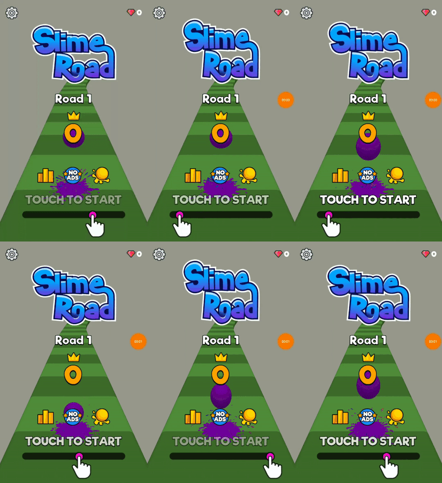
Animate In
Like I said, nothing appears out of nowhere. All the items here are set to a size of 0 and grow into the game world. It happens one at a time starting from the top.
Active Home Screen
This main screen is not a still image.
The title stretches in the X and Y directions to give a feeling of squishyness.
The "Touch to Start" text is fading in and out to attract the player's attention.
Finally, the hand is showing the player how to play the game. Remember the easing I talked about earlier. The hand speeds up and slows down at either end of the animation, with it's fastest speed in the middle.
Of course, there's the bouncing ball in the background.
Gameplay
Bouncing Ball
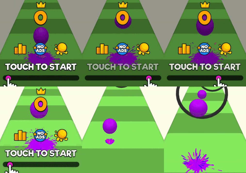
What stands out most is the slime from the ball. It looks like they used a few random images that are rotated at different angles and then fade away. There is also a splatter particle effect that lasts a brief second.
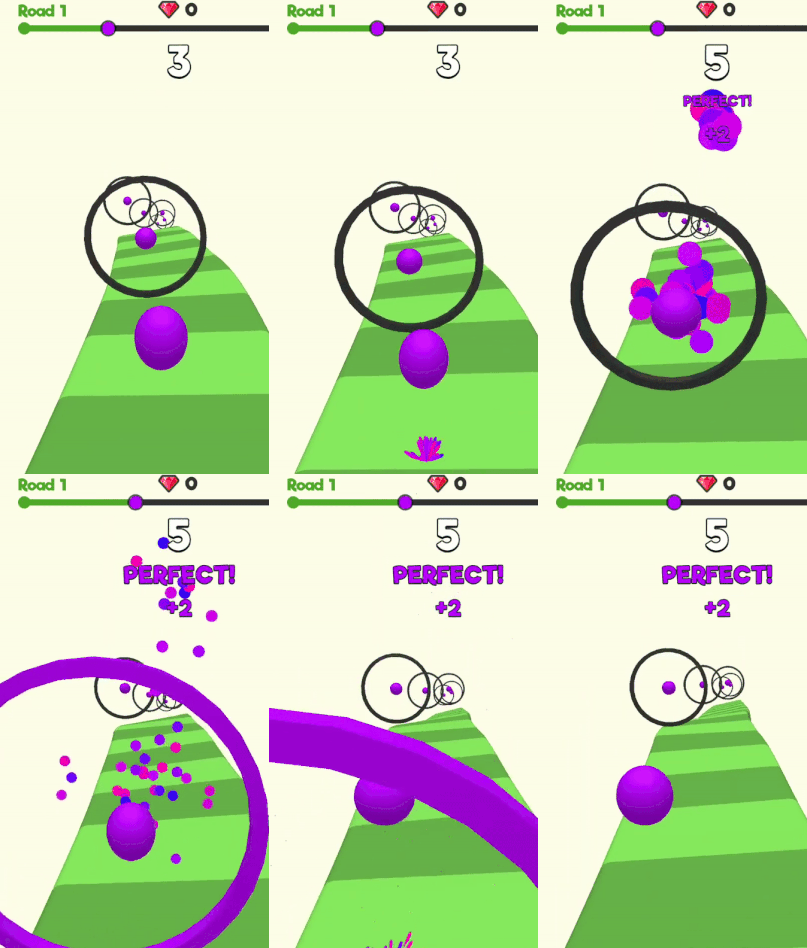
Then there is the easing of the ball bouncing. At the height of the bounce, the ball slows down. However, at the low end, when it hits the road, it is very fast to hit the ground and come back up. This mimics what it is really like to bounce a ball.
Finally, the ball has a squishy effect as the scale of the ball shrinks and expands on every bounce.
Scoring
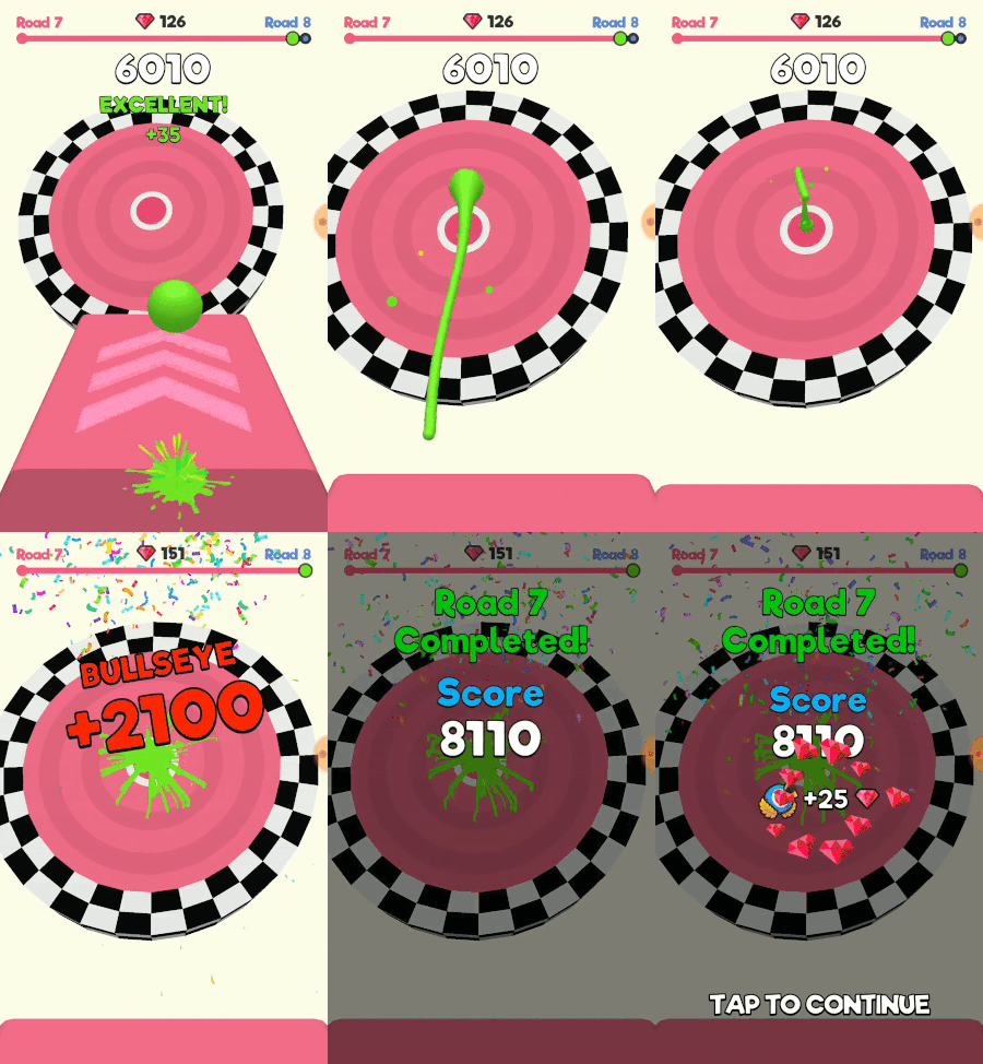
The ball must go through the rings to score points. As it does, the ball in the middle of the ring explodes into a bunch of particles. The ring changes color as well.
The score goes up every time the player does this. The score for each ring is indicated by a 'Good', 'Great', or 'Perfect' that animates from a 0 scale. The total score also animates every time it increases as it appears to grow for a split second before returning to it's static size. There is also the same particles from the ring appearing on the score text.
Each time the player scores, the distance indicator at the top of the screen will move forward. This does so in a way that is fast at the beginning and then slows down at the end.
Between Roads
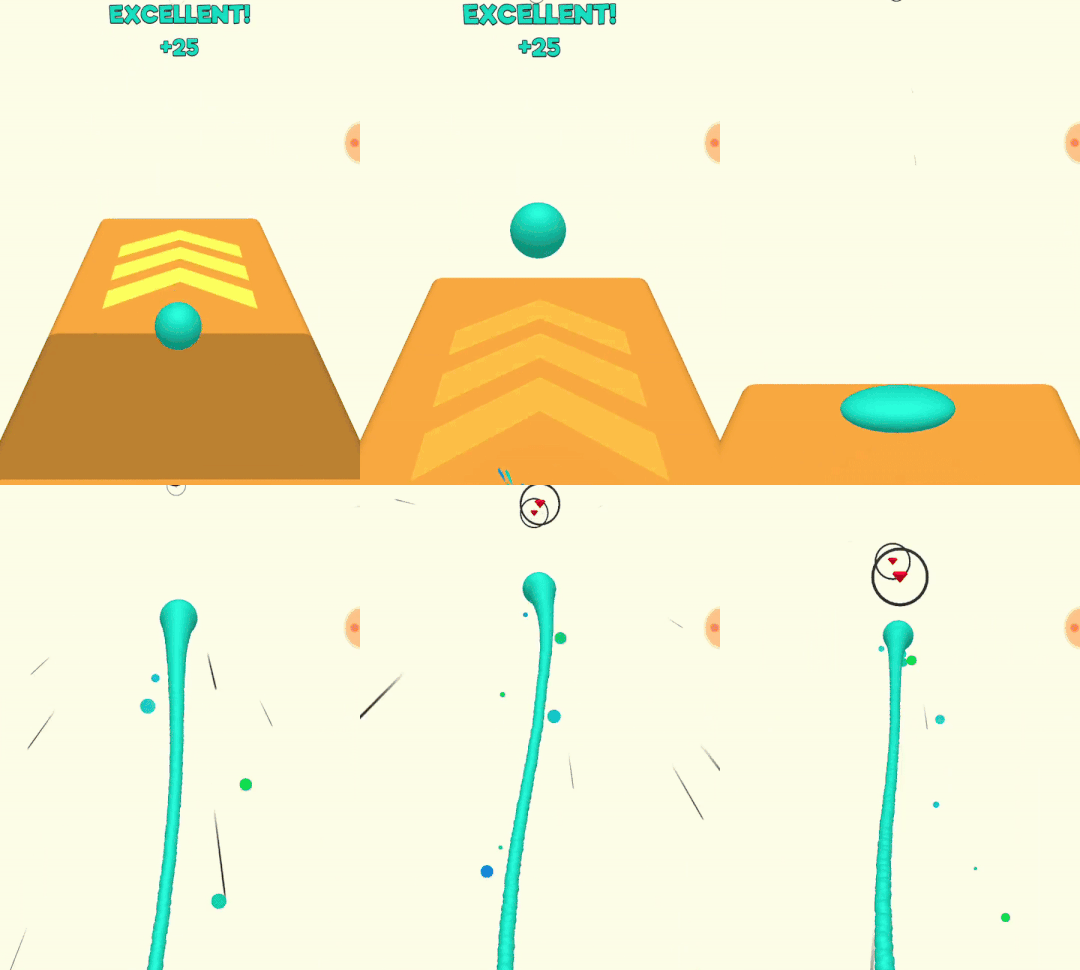
Every once in a while, the end of a road comes and the ball does one big jump that propels itself through the air to the next road. During this time there are gems that can be collected and spent to purchase skins.
The jump starts with the ball compressing down to a flat state before leaping back into the air.
The ball now has a wavy trail behind it which again helps with the slimey effect they are going for.
There are also line particles on the sides of the screen to give a sort of speed effect. The particles coming off the ball do the same thing.
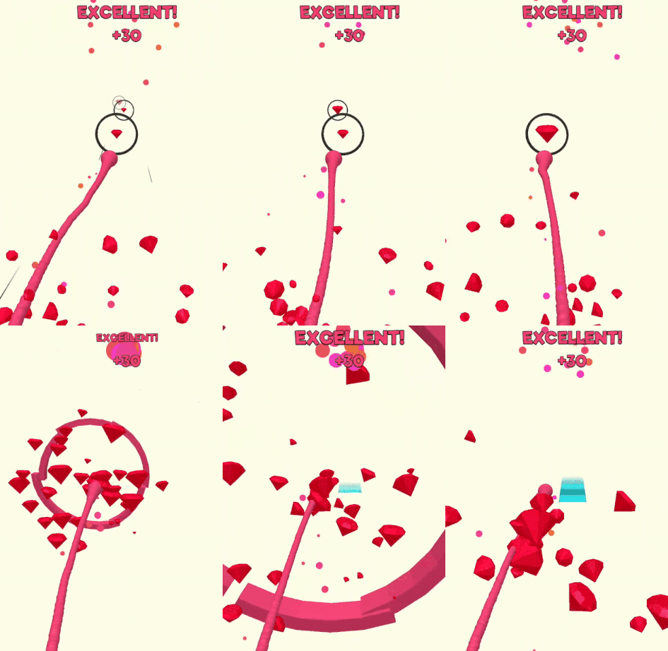
The gem rings are similar to the normal ones on the roads except that as you hit them, they enlarge before they disappear. There are still particles, this time as gems.
The last gem breaks apart in slo mo to really amplify the effect.
Game Lose
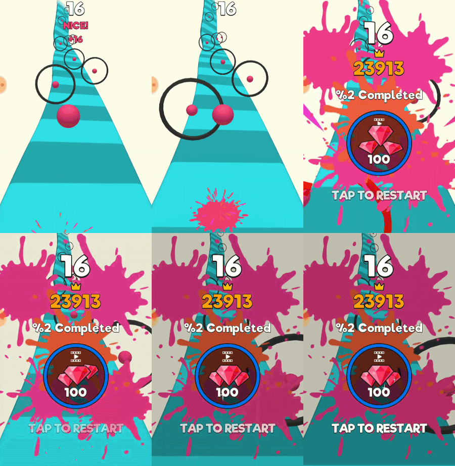
Losing creates a cascading effect of animations.
First, to lose the player must hit the ring that they are supposed to go inside of. When they do, the ring breaks apart into a bunch of pieces (similar effect to particles) and slime appears on the screen. Following quickly is text about how far they got and a restart indicator.
Remember, everything here does not happen instantly, they are animated in.
Here the player can also see the fading text to get them to keep playing the game.
Level Complete
Lastly we have the level complete sequence.
As the player approaches the end, they will see a glowing platform that fades in and out in front of a moving target.
The same big jump happens here like the between roads jump. It also goes into slo mo to emphasize the impact and moment that is finishing the round.
Lastly there is the slime as it hits the target. Particles hit and the drops of slime ooze down the side of the target. Confetti then shoots down from the top of the screen.
Finally, the level end text animates in showing the final stats.
Conclusion
The developers really ran with the whole slime theme and put a lot of effort into the little things. The squishyness and slimey feel of the whole game is all in theme. They are also consistent with how they animate the text.
Let's refer back to the juice tenets that we started with:
Nothing appears out of nowhere
Use easing functions
Particles!
Sometimes these animations or particles seemed to play such a small role in the game. Sometimes it's just a split second of movement and that may not seem important. But it is. It's more obvious when these elements are NOT present in the game and everything feels static and dull.
Luckily, these things are easy to implement! So go forth and animate, ease, and particle up your game. Hopefully then someone will compliment your game by saying it 'feels good'.
Tweet Star: Turning Tweets into Puzzles
Basics
Tweet Star is a twitter based word puzzle game for iOS developed by Simple Machine.
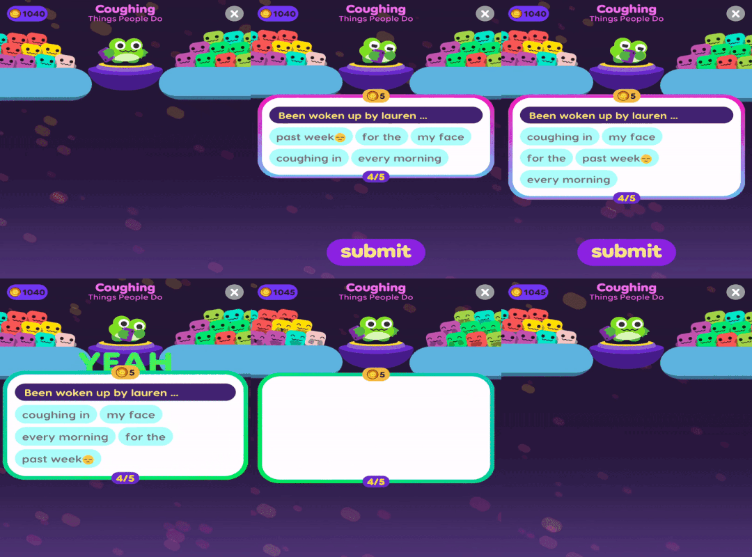
The player is given a scrambled tweet and must rearrange the words in the correct order.
There are certain rules that make sure the tweets are worthy for the game and rules that aid the player in unscrambling. For example, the beginning of the tweet is static, this gives the player a consistent place to start. The tweet must be grammatically correct and then is divided up into a certain amount of bubbles which can contain multiple words. These bubbles are then what the player unscrambles.
Simple Machine did a blog post about the design process and iteration of the tweet mechanic. That can be found at The Making of Tweet Star and will go deeper into that mechanic. Where that post is a peek from the inside of Simple Machine, I hope to give an analysis of the game design from the outside.
Tweets
Let's start off at the beginning and just appreciate the uniqueness of this mechanic. It's something I've never seen before and uses the Twitter API in a cool way.
There is an unlimited supply of fresh content. The tweets in the game are from the last 7 days. Every week there is something new and relevant with no need to update the app.
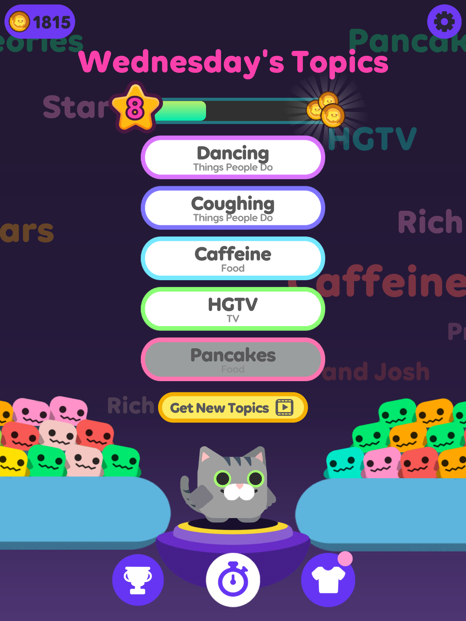
Each round is divided up into 5 tweets that fall under a wide range of topics. This could be a person, an event, a hashtag, a hobby, or even a place. The player can pick and choose which topics they want to do. This means they are not stuck playing a topic they have no interest in.
This is the only game where I have shared to social media from within a game. It's not just sharing the high score, I legitimately like some of the tweets I came across and want to share them.
Metagame
There are a couple aspects of the game that engage the player for long term progression.
Characters
Level system
Badges
Characters
During the game, the player's character is looking at their phone. Presumably they are looking at the tweet.
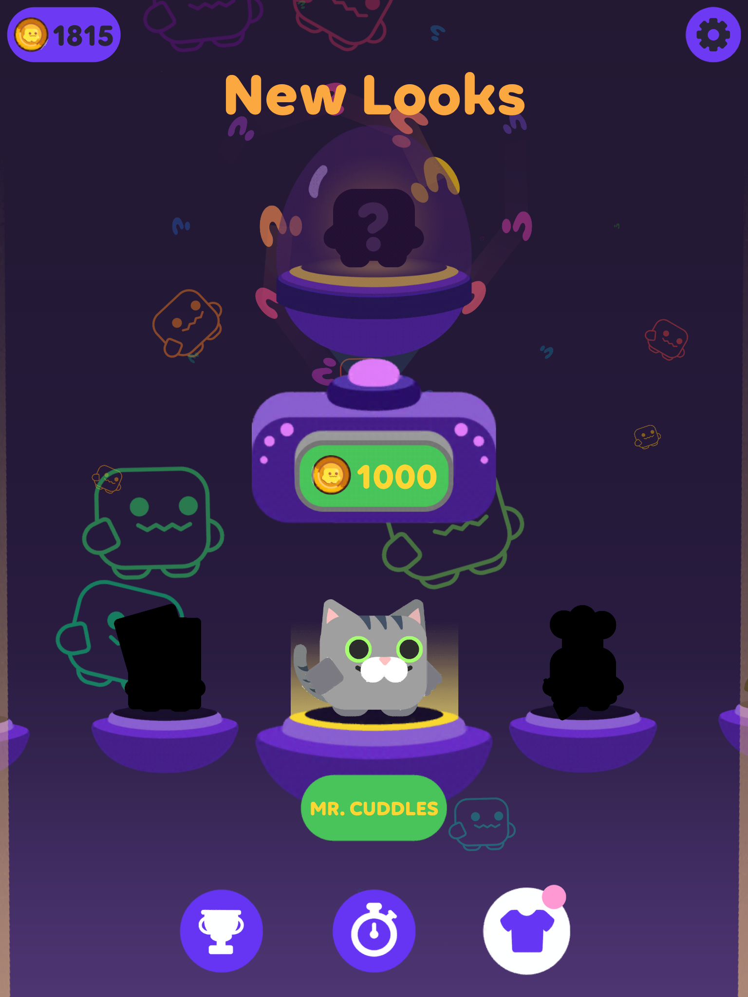
The characters are unlocked by using the coins you get through playing the game. 5 coins per correct tweet with characters costing 1000 coins each. There are other ways to get coins, more on that later.
There is a huge variety with over 100 different skins. Simple Machine calls these little creatures Meemos.
These really are nice skins and have a consistent aesthetic to them. They are also incorporated well in a game that doesn't actually require a character.
Level System
The level system is related to how many tweets the player has gotten correct and will give the player a sense of progression for doing that.
In each round there are 5 tweets to unscramble. After each round the player is awarded up to 3 stars.
5 correct tweets = 3 stars
3 correct tweets = 2 stars
1 correct tweet = 1 star
These stars then get added to the players experience bar.
After a certain amount of stars, the player levels up and they are rewarded with a random amount of coins ranging from 200 to 1000.
This mechanic makes sense in terms of rewards and progression. However the UX for this process takes FOREVER. It shows the player one tweet at a time, then shows the stars growing the experience bar, then the player must click through all the tweets AGAIN.
This entire process takes about 28 seconds and is not skippable. I get that Simple Machine wants to show the player's rewards and offer an opportunity to share the tweets, but after the first couple times it feels frustratingly slow.
Badges
These are stat tracking awards for things like unscrambling 100 tweets, unscrambling 50 tweets about food, unscrambling 50 tweets between 12 and 1pm, etc.
When these goals are achieved, the player is rewarded more coins.
These didn't affect my gameplay style that much. I wasn't choosing topics based on badges. I played most every topic and maybe skipped a couple if I really didn't feel like doing it.
Even though I don't think it adds much, it's a nice touch to the game and keeps the player going towards more goals. Fans of stat trackers in games will find this feature enjoyable.
Monetization
There are only 2 rewarded ads in this game. No banner ads, interstitials or in app purchases.
One is to get new topics to play. When the player starts the game, there are 5 topics to choose from. Once they go through those, or at least the ones they want to do, then they must watch a 30 second ad to get more.
This is pretty reasonable actually, that is 5 topics of 5 tweets each. It will take some time to go through 25 tweets.
It might actually take too long. Mobile games are meant to be played in 5-10 minute increments. It will take longer than that to go through 25 tweets. The topics get refreshed everyday. So if the player only wants to play once per day, they may never use this.
The second ad is for getting 50 extra coins at the end of a round. This is a pretty standard extra boost if the player really wants to get that next Meemo.
As a user, I think the amount of ads is great. None of the ads are intrusive and it feels fair to watch an ad to get more topics when I do need it.
However, from a design perspective, I actually question if this is profitable. Many other mobile games have more ads and still struggle with making money.
Conclusion
This is a very unique game that incorporates twitter in a very cool way (have I said that already?). It's definitely worth checking out whether you are a fan of interesting design or word puzzle games.
One thing that I have held off mentioning until now is that the game will no longer be updated. The game is still playable, but there are no new tweets to unscramble. All the content is from June-September of 2018.
I noticed the lack of new content and reached out to Simple Machine. They said that this game was a risky endeavor and unfortunately it did not pay off. The mobile market is rough and this game didn't catch the attention of enough people.
It seems that the tweets coming in require some human interaction. This was a major question I had after reading their blog post. Now it's clear that they couldn’t get the tweets and topics fully automated or there would be new content regardless of support.
It's very unfortunate to see such a well designed and polished game like this not be able to sustain itself.
Regardless, it stands as a game with a fascinating design. I'm looking forward to more unique games from Simple Machine
Prince of Persia: Escape - Why the Level Count is a Secret
Intro
Prince of Persia Escape is a casual mobile game published by Ketchapp with the Prince of Persia license coming from Ubisoft, their parent company. The development team was Estoty who is known for many other Ketchapp games.
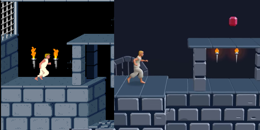
This game harkens back to the original Prince of Persia released in 1989 for the Apple II. The aesthetics are fairly similar even though the game makes the jump from 2D to 2.5D. The core gameplay of jumping over traps is very similar to how it was in the original, just with more modern mobile elements.
I'm actually surprised more franchises aren't going hyper casual. It's pretty easy to make these kinds of games and bring the franchise to new players. However, I know a lot of people wouldn't want to dilute or over simplify a franchise or character they love.
An even better use of hyper casual games would be for big brands. Remember games like My Coke Rewards? Coke could easily fund a casual game and see it reach the top of the app store charts.
I feel like I could write a whole piece on that topic alone but I'll stop by saying that I'm glad someone is doing it.
Core Gameplay
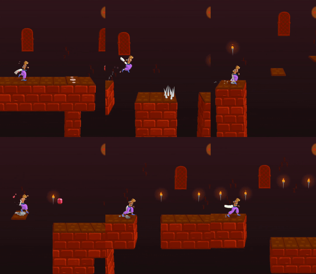
The game is a platformer where the player is constantly running forward (right) and a tap triggers a jump. There are obstacles like spikes, moving platforms, and pits that the player must successfully maneuver to get to the next level.
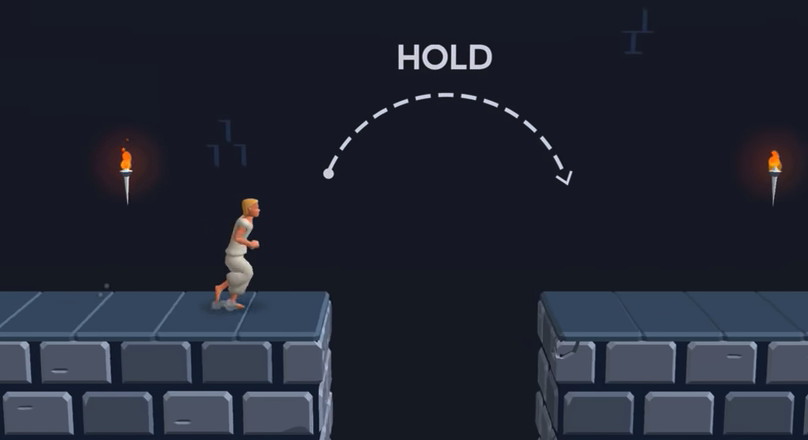
How long the tap is held will determine how long the prince will jump. The skill of the game is balancing short vs long jumps with well timed taps.
The game is a pretty standard mobile runner. There isn't anything new brought to the genre but its still a decent casual game.
There are a few nuanced game design choices made by Ketchapp that I'd like to take a look at.
Level system
This is a level based game. The player starts in a safe area, goes through some obstacles that last about 30 seconds to 1 minute before reaching the end of the level.
The interesting part is that there is no level selection screen. There is no way to go back and play a previous level. I think this is because most players just don't do that in these kinds of games.
This design choice declutters the UI/UX and simplifies gameplay. It also removes the need for the developers to put it in the game.
Ketchapp also does not say how many levels there are. I think they did this for a couple reasons:
Players WANT to finish the game but don't actually know when that is going to happen. I would argue this adds a sense of mystery and keeps the players wanting to keep going
Ketchapp can keep putting out more and more levels without anyone knowing
This can also backfire and actually turn players away. Since there is no known end, progression doesn't really mean anything. Completing 50/100 levels means you are half way there, but completing 50 levels in of itself doesn't mean anything without context.
The subtitle "Escape" also plays on this. That word suggests a story without the need for dialog or cut scenes. The player is trying to escape. However, at this point, there is no escaping. I searched online and no one has seemed to reach the end of the game.
I'm really interested in the data Ketchapp is getting on this game and whether this kind of level system is increasing retention or not.
Level Creation
It's pretty clear that the levels are created from reusable sub-sections. These can be connected easily by the flat areas with no traps. To be clear, I'm not saying the game is pure random procedural generation. Everyone who plays level 5, is playing the same level 5.
What is happening is either human or computer generated sequencing of these sub-sections to supply unique levels. The combinations of these could be in the thousands.
Ketchapp could introduce new sections and increase the overall amount of levels.
Death is Inevitable
In most infinite runners, the player is shown all the information to survive and given a split second to react and avoid death. However, in this level based system, that is not a requirement.
There are certain situations where sometimes the player can't see what is coming next. They will almost always die the first time they come across these situations.
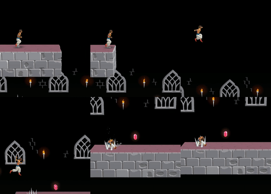
For example, the player could come across a drop where they have to jump down, but they can't see where they are going to land. There are spikes on part of the landing, but they don't know which part of the landing. The player has to figure that out by trial and error. The first time they will likely fall and hit a spike. The next time they may try a long jump, but still hit a spike. Finally they realize they have to jump a few feet before the ledge in order to land in between the sets of spikes.
This forces the player to memorize certain parts of the level. It also keeps really good players from just breezing through the game.
Many people will complain that this is just a monetization tactic. If you die, you can watch an ad to revive or even skip the level entirely. Ketchapp puts these likely death situations near the end of the level to entice you into watching an ad.
To some degree, yes this is exploitative. But there are tons of games where you have to memorize the level in order to progress. In Dark Souls, you have to memorize enemy patterns in order to kill them and continue. The only difference is that there is no 30 second ad you can watch to get passed the enemy, you just have to retry.
So while this is a common design choice made in games, Ketchapp is using this opportunity for monetization. How much these cheap deaths are architected to drive profits is up for debate.
Tutorial
The tutorial for this kind of game is pretty simple since most people understand the tap to jump mechanic. There is simply one short jump and one long jump with text on how to get over the obstacle.
The design decision that is cool, is that the tutorial will repeat itself at the beginning of a level if you haven't played the game in a while. This brings players back into the game quickly and smoothly. It's very short and very simple so I don't mind doing it again.
I have returned to games after long hiatuses and been confused by what to do upon return. Now this game is super simple and it's hard to forget the mechanics, but it's a nice touch and a concept designers could use in other titles.
Unfortunately, on levels where the tutorial does show up, it will keep repeating if you die in that level. So repeating the tutorial over and over again if you are struggling with a level can become quite annoying.
Gems
The gems you collect throughout the game are used to unlock skins. There are heads, shirts, and pants. As of this writing, there are 9 of each totaling 27 unlockables. The price for each increases each time you buy one.
This stretches out the reward system. They reward players early with some skins right off the bat and then start delaying that reward as the player gets deeper into the game.
Monetization
Ad placements
Banner ad at the bottom
Video ad to revive
Video ad to skip level (rare)
Interstitial ads between levels and restarting a level
Rewarded ad to get gems
A very common monetization model. I found myself using the level skips in certain occasions when I just didn't want to have to replay the level and waste my time.
Juice
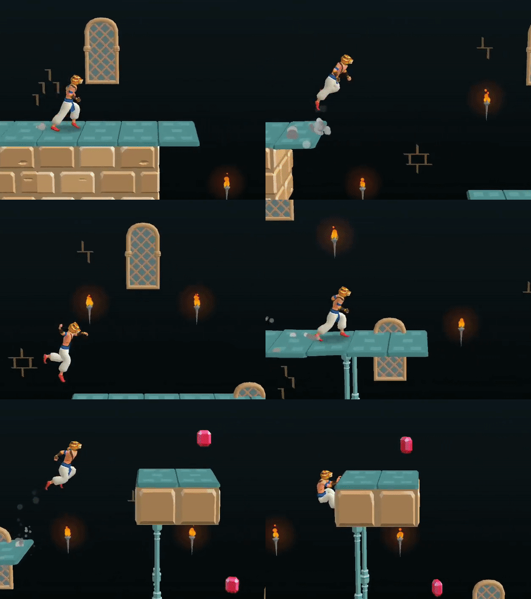
Landing/jumping dust particles
The only piece of juice that stands out to me. They do a very good job with the dust for jumping and landing.
Conclusion
Overall, a pretty basic endless runner game. It's interesting to see Ketchapp's choice of metagame and how that affects the addition of more levels.
I would like to see some sense of progression as the player starts to get into the hundreds of levels. The game just isn't compelling enough for me to keep playing, and I'm not even at level 100 yet.
It will be interesting to see if Ketchapp puts out more casual games from Ubisoft’s long list of IPs.
Space Frontier 2: Game Design in Depth
Basics
Space Frontier 2 is a space exploration game published by Ketchapp and developed by Part Time Monkey with Design by LynxSwamp.
The game tasks the player with exploring the galaxy one solar system at a time.
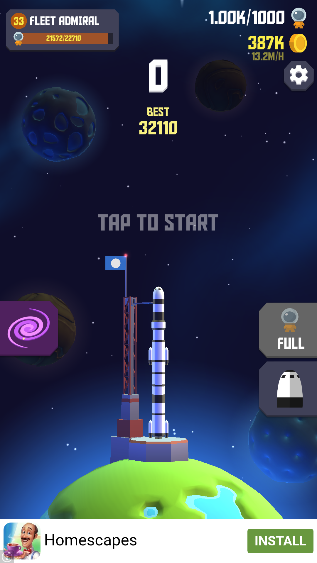
The player launches a multistage rocket into space and then taps the screen in order to detach each stage of the rocket. Detaching a stage reveals another rocket booster which propels the rocket further into space.
Each planet reached is colonized by the astronauts on board the rocket. These astronauts passively generate money that can be spent on rocket upgrades, more astronauts, and further exploration into the galaxy.
Core Loop and Metagame
The core gameplay for Space Frontier 2 is launching the multistage rocket into space to land on planets. The player repeats this process to generate money.
The metagame is exploring the galaxy and reaching new solar systems. Each new system contains the same core gameplay as the first. The difference being that the rewards for rocket launches and cost of upgrades are all higher.
Launch and Landing
The launch begins by tapping the rocket. Each additional tap will detach a stage of the rocket. The later the tap, the more money that is rewarded, and the further the rocket will go. However, tap too late and the rocket will explode.
The tap timing mechanic is represented by a circular dial that depletes in a counter clockwise direction.
There are 5 different ratings for rocket detachment: Ok, Good, Great, Perfect, and Impossible. The latter 3 will reward the player with money. In the first solar system, Great pays $10, Perfect pays $20, and Impossible pays $80.
These rewards increase in successive solar systems. The first 8 are shown in the table below:
| System | Great | Perfect | Impossible |
|---|---|---|---|
| 1 | $10 | $20 | $80 |
| 2 | $10 | $20 | $80 |
| 3 | $25 | $50 | $200 |
| 4 | $45 | $90 | $360 |
| 5 | $80 | $160 | $640 |
| 6 | $135 | $270 | $1,080 |
| 7 | $215 | $430 | $1,720 |
| 8 | $315 | $630 | $2,520 |
The base Great payout determines the other two. Perfect is always twice as much as Great and Impossible is always eight times as much as Great.
Disregarding the first two planets, the payouts increase exponentially. This graph illustrates that point. You can see how much separation the Impossible eight times value makes the further into the galaxy the player explores.
Landing on planets also rewards money. The further the planet in the solar system, the more money that is rewarded. Just like the stage detaching payouts, these also increase exponentially between solar systems.
| System | Planet 1 | Planet 2 | Planet 3 |
|---|---|---|---|
| 1 | $45 | $90 | $135 |
| 2 | $45 | $90 | $135 |
| 3 | $75 | $150 | $225 |
| 4 | $120 | $240 | $360 |
| 5 | $195 | $390 | $585 |
| 6 | $300 | $600 | $900 |
| 7 | $450 | $900 | $1,350 |
| 8 | $645 | $1,290 | $1,940 |
There are about a dozen planets in each system, however we only need 3 to notice the payout pattern. In each of the solar systems, Planet 2 is twice the value of Planet 1 and Planet 3 is three times the value of Planet 1. Therefore we can just use this equation to solve for the cost of each planet:
Planet X Reward = Planet 1 Reward * X
This is simply a linear equation. However, the payouts between Solar Systems (disregarding the first 2) is exponential.
An interesting fact about landing on planets. As long as the rocket doesn't blow up, it will almost always land on a planet. There is a brief period before reaching the first planet where the rocket will just float in space endlessly. However, once the rocket passes the first planet, it will always land on one.
I think this attributes to the casual nature of the game. It's really hard to reach a losing state. The game keeps pushing the player forward, skill will just help progress faster.
Rocket Upgrades
Rocket upgrades will add an additional stage for more boosting power. This enables the rocket to go further and land on more valuable planets.
In the first system, the cost for the first upgrade is $60 and then every future upgrade is $60 more. So the 5th upgrade would be $300. Again, this is a linear increase. However, between solar systems is again an exponential increase.
| System | Cost per Rocket Stage |
|---|---|
| 1 | $60 |
| 2 | $260 |
| 3 | $890 |
| 4 | $2,210 |
| 5 | $4,530 |
| 6 | $8,170 |
| 7 | $13,500 |
| 8 | $20,800 |
When I say exponential I mean that we can match a polynomial equation to these data points.
Using a site like http://www.xuru.org/rt/PR.asp I plot the data points and can get an approximation of a polynomial equation up to a selected polynomial degree. If the degree is 2, then the equation would look something like:
y = a + bx + cx^2
A degree of 3 would add dx^3 onto the end of that equation. The higher the polynomial degree, the more accurate the equation. While I could just select a degree of 10, it's best to simplify the equation as much as possible while still staying accurate.
With the above data set (and some rounding) we get an equation of:
y = 53 x3 - 129 x2 + 245 x - 118
We can then use this equation to make a prediction about future solar systems. If we plug in 9 for x then we get $30,400, which turns out to be the correct cost for the first rocket upgrade in the 9th solar system.
I think these kinds of equations are interesting to figure out because we can start to dissect the math in the design of the game. This is especially true for a game with idle mechanics like this one where how much money the player has is directly proportional to their progress within the game.
Astronauts
We've covered the basic way of making money within the core gameplay loop. However, the biggest money making venture comes from colonizing the planets with astronauts. This is done by simply landing on a planet while the rocket contains the little explorers.
Each ship starts with 1 astronaut on board. The player must pay for each additional astronaut. In the first system, the first astronaut to board the rocket costs $1, the second is $2, then $3. A linear progression just like the rocket upgrades.
If the rocket successfully lands on a planet, each astronaut will generate money over time. In the first system, each astronaut generates $11 per hour. This is the idle mechanic in the game and is where the real money comes in.
It's worth noting that it does not matter which planet the astronauts land on, they all generate the same amount of money.
It should be expected at this point that I'm going to look at the costs and idle generation of these little space cowboys between different solar systems. Let's look at a graph comparing the cost to the per hour rate.
| System | Cost per Astronaut | $/hour for each Astronaut |
|---|---|---|
| 1 | $1 | $11 |
| 2 | $4 | $22 |
| 3 | $8 | $33 |
| 4 | $13 | $44 |
| 5 | $21 | $55 |
| 6 | $29 | $65 |
| 7 | $40 | $76 |
| 8 | $52 | $87 |
| 9 | $65 | $98 |
| 10 | $81 | $109 |
| 11 | $97 | $119 |
| 12 | $116 | $130 |
| 13 | $136 | $141 |
| 14 | $157 | $152 |
The hourly generation of each astronaut increases linearly while the cost increases exponentially. This means that over time it will take longer for the astronaut to make up for it's initial cost. Meaning that the further the player gets into the game, the longer it will take to get enough money to explore more solar systems.
In the first solar system, the first astronaut costs $1 and generates $11 per hour. So that astronaut is net positive after 1/11 of an hour or 5.5 minutes. Each additional astronaut will be an additional 5.5 minutes of time to become net positive due to the linear nature of the cost.
For the 14th solar system, the first astronaut generates $152 per hour while costing $157. That astronaut will be net positive after about 1 hour of real life time. Each additional astronaut is another hour on top of that. If the player loads up a rocket with 72 astronauts, that last astronaut isn't profitable until 3 days later.
This is one way the game is extended the deeper the player is in the game. If the player is already hooked on the game, the developers don't need to reward them with a new solar system nearly as often as early players.
Monetization
Other than the standard banner and interstitial ads, Space Frontier 2 has a wide variety of rewarded ads. This is where developers get creative in their monetization efforts.
How can the developers reward the player for watching an ad while also not making them feel like it is required to progress in the game? Good rewarded ads strike this balance well.
Rewarded video to unlock new rocket skin
When the player lands on a planet, sometimes there will be a piece of cargo floating in it's orbit. These contain new rocket skins. To unlock it, the player MUST watch a video ad.
While I'm not sure I 100% agree with locking skins behind a 30 second ad, I do like that this rewarded ad has no affect on gameplay. A lot of the time, I did find myself watching the ad because I wanted some variety in my rocket.
An interesting bit about this is that the player finds the piece of cargo and will actually lose the cargo if they continue on without watching the ad.
This is a psychological tactic known as loss aversion. The game threatens to take away something that the player acquired through playing the game. We, as humans, don't like this. It is much more likely that we will watch the ad to avoid LOSING the cargo than if the situation was reversed. For example, if they said we could watch an ad in order to GAIN a new skin. The former is also much more immersive within the game universe.
This is a recent trend I have seen in a couple other games. Most notably Hooked inc by Lion Studios. Where the player fishes out a treasure chest full of the premium gem currency. The catch is that they can only get the gems inside if they watch an ad.
2. Rewarded video to add 30 astronauts to the rocket
This is useful if the player is very impatient with the current pace of the game. Even if the player doesn't have enough money to add astronauts to the rocket, they can still keep doing that by watching an ad.
It's worth noting that the best strategy is to buy astronauts first and THEN use this rewarded ad because those later astronauts cost more money.
3. Rewarded video to increase idle profits
This will increase the colonizer idle profits by 2x or 5x for a certain amount of time. The 2x boost can be done anytime in the galaxy view. The 5x boost is acquired similar to the cargo and is represented as a satellite orbiting a planet.
This is a pretty standard rewarded ad and will just speed up the gameplay a bit.
4. Rewarded video to save the astronauts if the rocket explodes
This is by far my favorite. I use it almost every time because it really plays on loss aversion. Not only did the rocket explode but all the astronauts shoot out in a glorious animation. The player loses the astronauts, the money spent on them, and the time for that launch. Watching the ad reduces that loss.
Honestly, I think this is a brilliant rewarded ad mechanic. The player is not getting towards the goal faster, they are just not losing as much as they could.
There is also a paid subscription service. It's something like $7 per week and gives some bonuses. This is really just going after the whales and impatient players as it's really not required to progress in the game. Most of the benefit is just progressing through the game faster.
Comparison to Space Frontier 1
This game made multiple changes from the first game.
Bigger and better metagame
The first game was limited to just 3 planets. However, it takes more time to get to those planets than a planet in Space Frontier 2. It's about as equal to discovering a new solar system.
Where Space Frontier had 3 of these planet/solar system starting points, Space Frontier 2 has somewhere in the ballpark of 100.
There is also no metagame screen in the original. The galaxy view really encourages exploring new planets and gives the player a good sense of progress. I actually had to look up online if there were additional planets in the original because the game doesn't spell out a definitive end.
2. Different rocket detachment mechanic
The first game had an integrated rocket detachment mechanic. Each rocket stage shrunk up into the rest of the rocket and the player had to tap when it was almost to the next stage. This is in contrast to the simple circular dial in the sequel.
I would argue that there are positives and negatives to both. Most people I've talked to believe that the original mechanic was better because it was more immersive. And I agree, it was much more immersive. However, it was also hard to know when to tap. The rocket literally goes up into itself, which means the player can't clearly see when to tap for a perfect rating.
I think some kind of middle ground could have been achieved where the player has a better visual indicator of when to tap combined with a more immersive mechanic.
Game Juice
Game Juice - additions to the game that increase responsiveness to player interaction and a sense of good "feeling". Most of these don't affect gameplay and are visual or audio in nature.
Rocket Lerp
First, lerp is short hand for linear interpolation. This is a method of fitting a curve to construct new data points within a range of known points.
One of the coolest things the developers use this for is when landing on a planet and discovering a new solar system.
There are 2 known points, the starting rocket point and the landing point. Instead of just using a straight line, the rocket goes in a non-linear path.
In the instance of landing on a planet, this looks like the ship gets stuck in the planets gravitational pull as the rocket flies past the planet. It slows down until reversing course to land on the planet.
The lerping for discovering a new solar system is less representative of real life physics and more just for fun. The rocket will do a large loop before arriving at it's destination.
2. Adding astronauts to the ship
Every time the player taps to purchase an astronaut, a tiny suited up human will appear on the launch pad and board your ship. Doing this a bunch of times in a row is very entertaining as loads of space explorers board the ship all in a line.
3. Rocket detachment
This whole process is just really juicy. The circular dial has sparks coming off it, tapping turns the whole dial a color related to how well you did. At the same time the rocket stage detaches and flies off into space as the rest of the rocket keeps thrusting upwards.
Final Thoughts
I think this game excels at different aspects of what makes for a good casual game:
It has a simple core loop that is very juicy.
The metagame is well incorporated into the theme of the game and keeps the player moving forward with a good sense of progression.
There is a variety of rewarded ads that feel fair to use but not necessary to progress through the game.
The graphics and sound effects are high quality and cohesive.
Of course there are always improvements that can be made.
Tap Mechanic
The tapping mechanic could be more immersive. They took a step backwards from the first game in that respect.
Metagame Gets Old
The metagame got pretty old after a while. I think this is hard to avoid with casual games. Everyone will get bored of the core gameplay at some point and for me it was after 25 solar systems.
More specifically, I reached a point in the game where I almost stopped worrying about money. At about solar system 15, I discovered that I was making so much money from that system, that I could go back to system 1 and very quickly max it out to 1000 astronauts. At the current moment, I am at system 25 with all previous 24 systems maxed out. Every day I generate enough money to explore a new system with enough left over to max out the previous system.
With this strategy, I can check into the game once per day and explore one more solar system. It was at this point that I got pretty bored with the game. The sense of exploration had come to an end and there were no new mechanics to discover.
I have also been able to figure out how long it will take me to explore the next galaxy. By comparing my hourly income to the cost of the next solar system. I found that the time to do so increases steadily.
In the table below, for each current system I have 100 astronauts and a max of 1,000 astronauts in all previous systems.
| Current System | Next System Cost | Hourly Income | Time to Next System |
|---|---|---|---|
| 20 | $19.3mil | $2.08mil | 9.28 hours |
| 21 | $23.2mil | $2.29mil | 10.13 hours |
| 22 | $27.6mil | $2.52mil | 10.95 hours |
| 23 | $32.6mil | $2.76mil | 11.81 hours |
The time to next system is calculated by taking the next system cost and dividing it by the hourly income.
This means that the later solar systems will start to take multiple days to explore. Of course, there are the rewarded ads that will double your idle income so progress could be sped up.
One thing that each new solar system brings is a new rocket 'invention' that changes the appearance of the rocket. It is cool to see the rocket evolve but not enough to keep me going, especially if those 'inventions' don't change the mechanics of the game.
I hope you enjoyed reading this design analysis of Space Frontier 2. Please comment here or wherever you found this article so we can continue the discussion!
Paper.io 2: A Natural Difficulty Curve
Intro
Paper.io 2 is the follow up to Voodoo's breakout hit Paper.io.
Paper.io is what originally landed Voodoo on the mobile gaming map. Now, after a dozen more games and becoming a top mobile publisher, Voodoo comes out with the sequel.
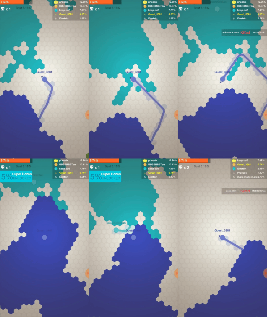
I'm going to take a look at Paper.io 2 from a game design perspective. I will look at the overall flow of the game, the design of the difficulty curve, and a psychological trick that will keep players coming back.
Basic Description
The objective of the game is to control 100% of the arena. You play as a small, ever moving square with a small starting territory that corresponds to your square's color.
There are other players that start the same way and have the same goal.
In your own territory, you are safe. When you leave, you create a trail that draws onto the arena. If you make it back to your territory then you gain control of the territory you just traversed.
If someone else hits your trail, you die, your territory is lost, and you must start over.
A major difference between Paper.io 2 and the original is how you move. In the original, you could only move in 4 directions: up, down, left, and right. Now you can move in any direction. The arena is now circular instead of square to complement that change.
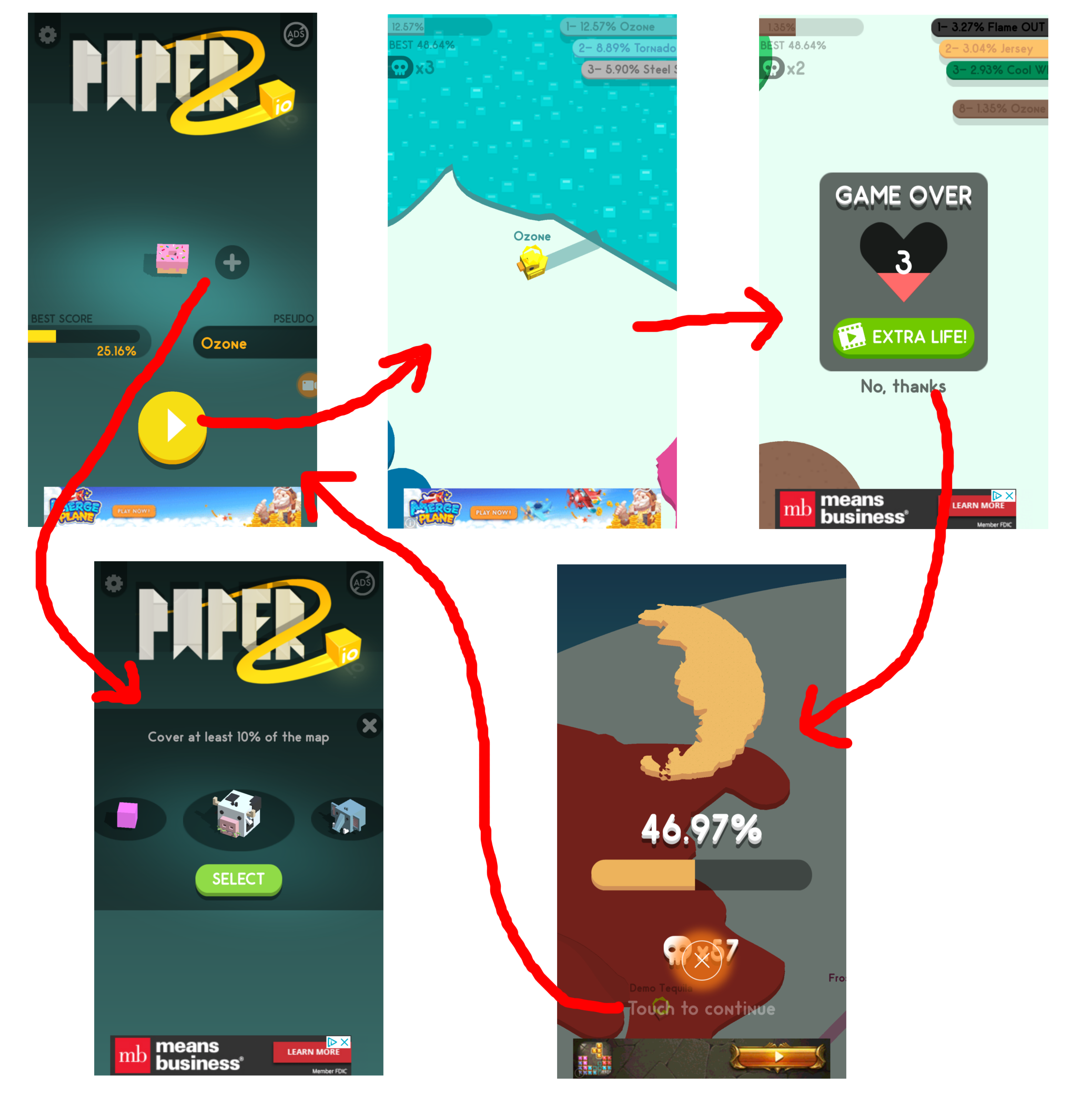
Game Flow
The game starts with a screen displaying your current character and your high score, which is displayed as a percentage of the highest area you have conquered.
You may select any characters you have unlocked and then start the game.
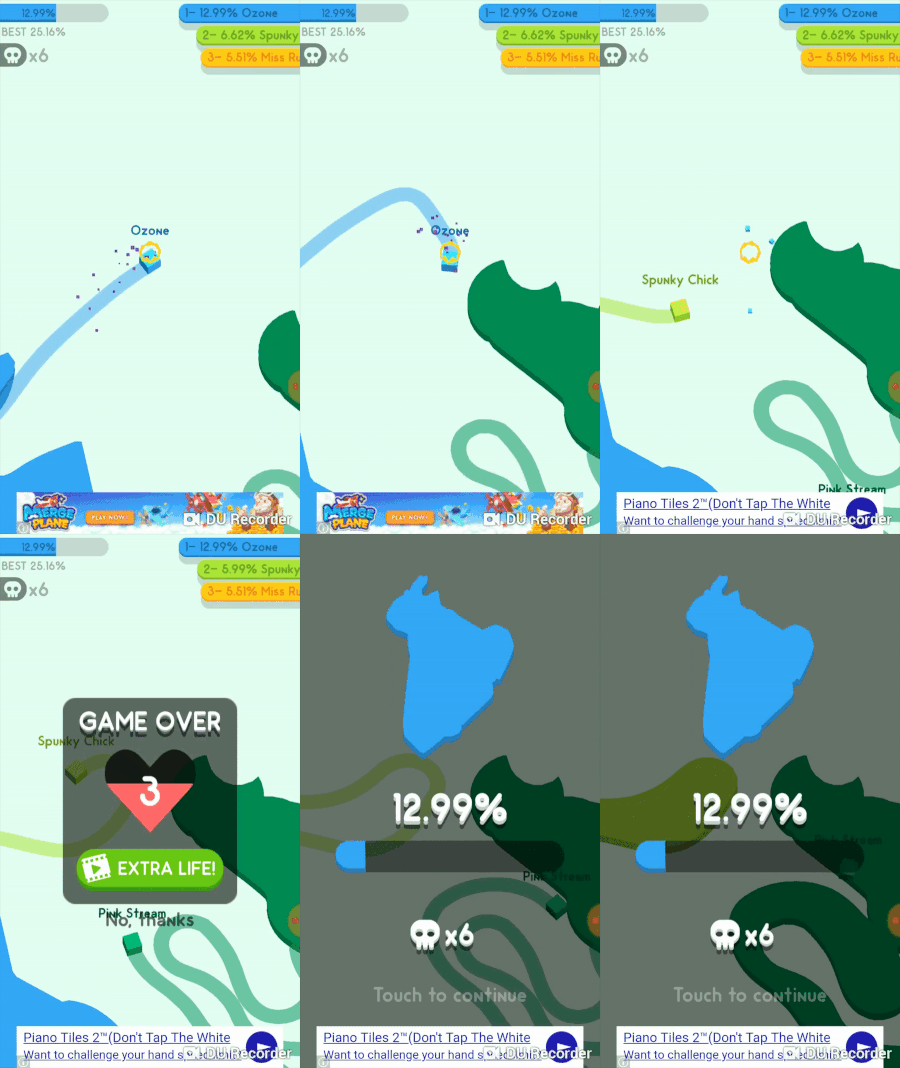
You conquer territory and kill other players until you die. You are then presented with an opportunity to watch an ad to get an extra life or decline the offer to return to the main screen.
Game Mechanics
First of all, this game is not played with other humans. You are playing against bots. This means it's a free-for-all between you and a bunch of AI.
You are dropped into an ongoing game, which means some bots could already have taken a chunk of the arena.
New bots are also added throughout the game. So no matter how many bots you kill, they will just keep coming. The only aspect of their spawning that you can rely on is that they will never spawn in your own territory.
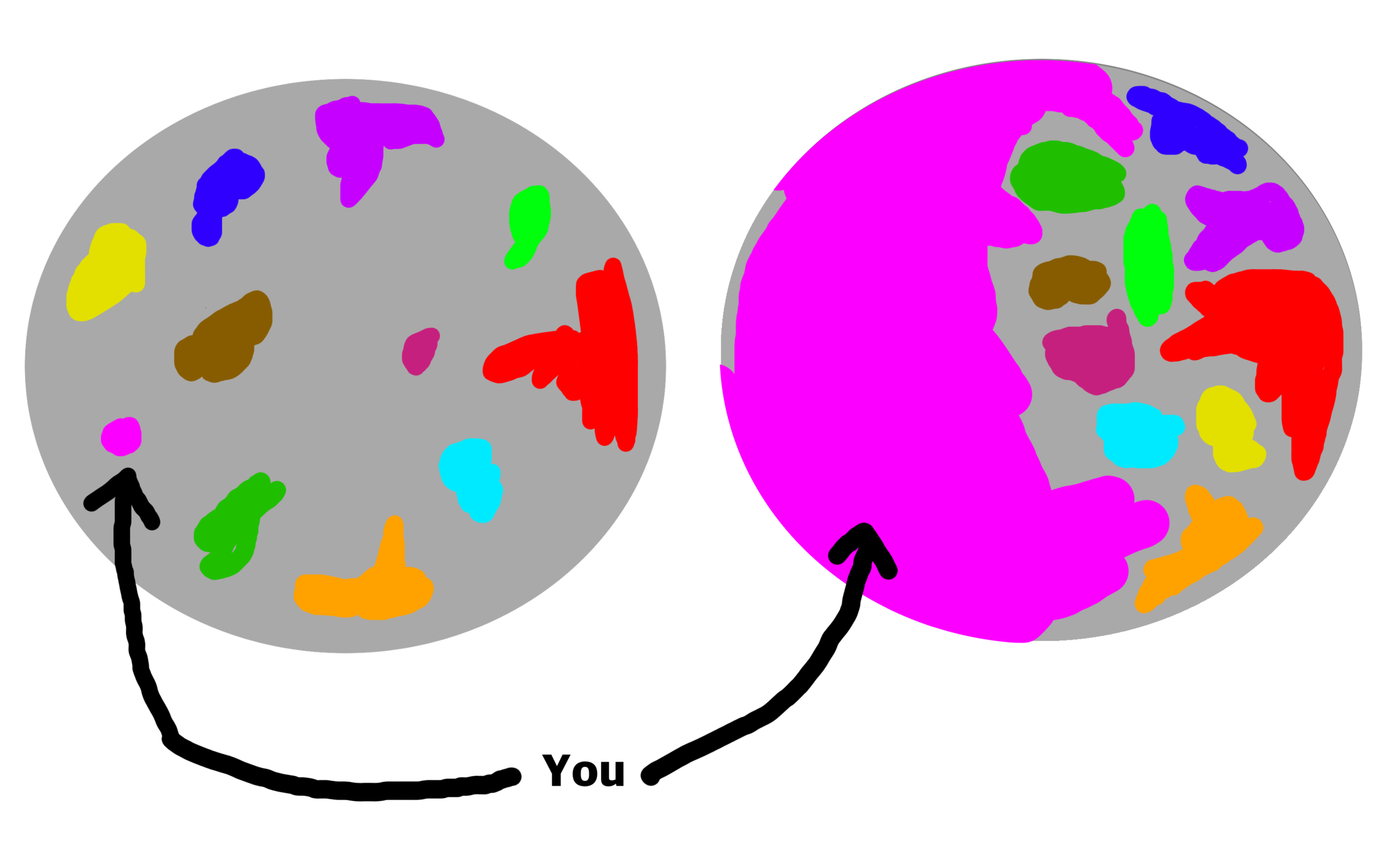
The number of bots compared to how much territory you have conquered directly correlates to the difficulty of the game.
At the start of the game, you spawn with 0.66% of the playfield. If there are 10 other bots, then there is 99.34% space for them to occupy. If you own 50% of the arena and there are still 10 bots, then they are in the other 50%, a much more concentrated area. This makes it harder to venture out of your territory without bumping into someone else.
This is one of the ways the game gets more difficult. Less space but the same amount of bots. Towards the end of the game, any free space would get used to spawn another bot, creating a hectic situation.
This balance of space to bot count could be managed itself by AI, potentially decreasing the amount of bots as space becomes cramped.
The other way the game could manage difficulty is the AI of the individual bots. The bots are tasked with taking space and killing you or the other bots.
In order to increase the difficulty, the bots just need to be more aggressive toward the player, attacking you whenever you leave the safety of your own territory.
If you kill an aggressive bot, the game just spawns another in it's place. The life of one individual bot doesn't matter much.
I could be over analyzing this and I don't actually have any data to back that claim up. But it's the only other major way the game could scale difficulty.
Getting to 20% or even 40% has not been too difficult. However, I think it would take a long, long time to achieve 100% due to the difficulty curve. At a minimum, you would have to be very conservative when taking territory which would end up in a very long play session.
My high score of 48% took about 10 minutes. And guess what, there is no pause button!
Strategy
So knowing what we know about the AI, we can come up with some strategies to get the most area possible.
Take the walls
The edge of the arena is the safest place since there are no enemies there. You put yourself up against a wall instead of being surrounded by the bots. You also can't die by hitting the walls (unlike Paper.io 1).
2. Wait until you know you can kill someone
The AI are bound to slip up. It's pretty easy to chill in your territory and watch a bot until they leave their space. Then, once they are a distance farther from their own territory than you are to their trail, you can strike with high certainty to kill them.
3. Take enemies space directly after killing them
When you kill a bot, their territory disappears. This is the best time to take a risk and capture the space. This is because you know other bots are not likely to be there. Just be careful of a new bot spawning in.
4. Don't venture out too far
This might be obvious, but my deaths always come from going out too far. Someone then comes into my field of view and I realize there is no way for me to make it back.
This limited field of view is what makes this game so difficult. If you could see the entire playfield at all times, then winning becomes much easier.
Metagame
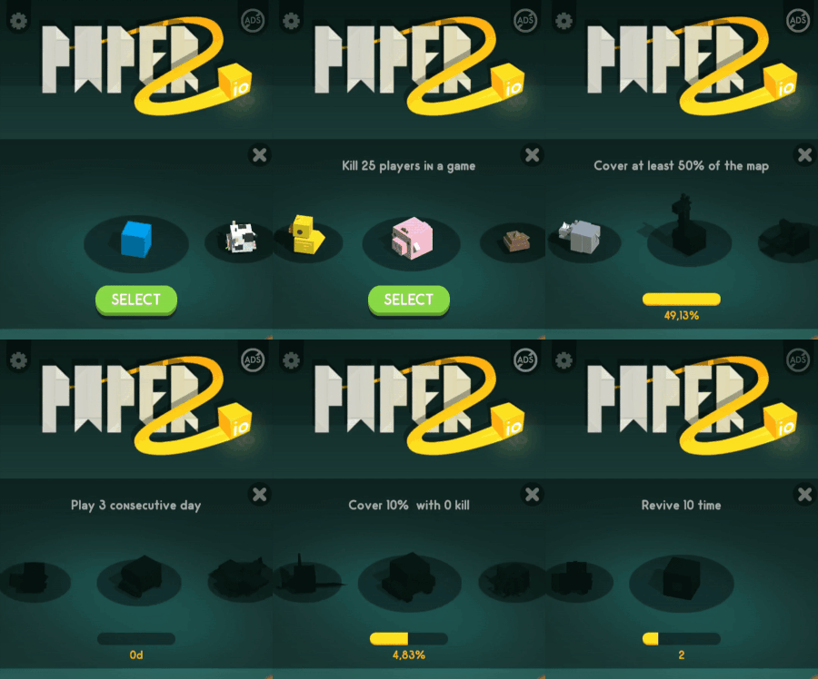
The only metagame is unlocking new skins.
This is achieved by completing certain stat based challenges within the core game like getting 75% of the arena space or killing 25 players in a single round.
The skin changes the character and also the territory that you own, changing it's color or pattern.
Metagame isn't as required in a pure competitive game like this one. There is nothing to upgrade or currency to gain. The motivation comes down to skillfully earning that 100% victory.
Psychological Tricks
Speaking of that 100% victory. It's displayed as a percentage on purpose.
One of the things we've been trained to do in games is fill those percentage bars to 100% to 'complete' whatever task it was asking us to do.
The Zeigarnik effect, discovered in 1927, describes the phenomenon of finding it easier to recall a task that you have started, but not yet completed.
Completing a task gives a sense of closure, a release of tension, and apparently, a departure from our memory.
Now most games have progress bars that tap into this effect and our drive to be completionists. Quest logs in RPGs or leveling systems in multiplayer games are just a couple examples.
So why do I point it out for this game in particular? Because there's only one quest. Just get that one bar to 100%. Should be simple, right? The thing is, I think you'll be playing for a long time to complete this one quest.
Monetization
There are 3 ads and 1 IAP in the game:
A banner ad at the bottom of the screen at all times.
An interstitial ad after you die.
A rewarded ad that revives you 1 time during the game.
One IAP to remove ads.
This is a very common formula for Voodoo games. It's sticking ads in all the places that don't intrude on gameplay. The revive mechanic is very common in casual games. Players will use it when they capture enough territory that they think it merits a use to not lose their progress (me included).
I'm still surprised Voodoo doesn't include skins that can only be purchased using IAPs. It's something Ketchapp and many other casual developers do. It doesn't change the gameplay but is available to those who really want them. The omission of these must mean that Voodoo doesn't think they are worth the development cost of putting in.
Another IAP that Voodoo could include is paying for extra lives. I'm actually very happy this is not included since that's just pay to win. Voodoo would then be incentivized to make the game even harder, forcing you to pay money in order to get 100% completion.
With what they currently have in the game, I feel the ads are fair.
Game Juice
Here I like to highlight aspects of the game that don’t affect gameplay, but really help make the game 'feel' good.
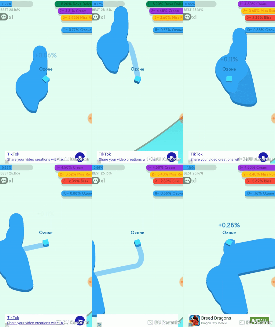
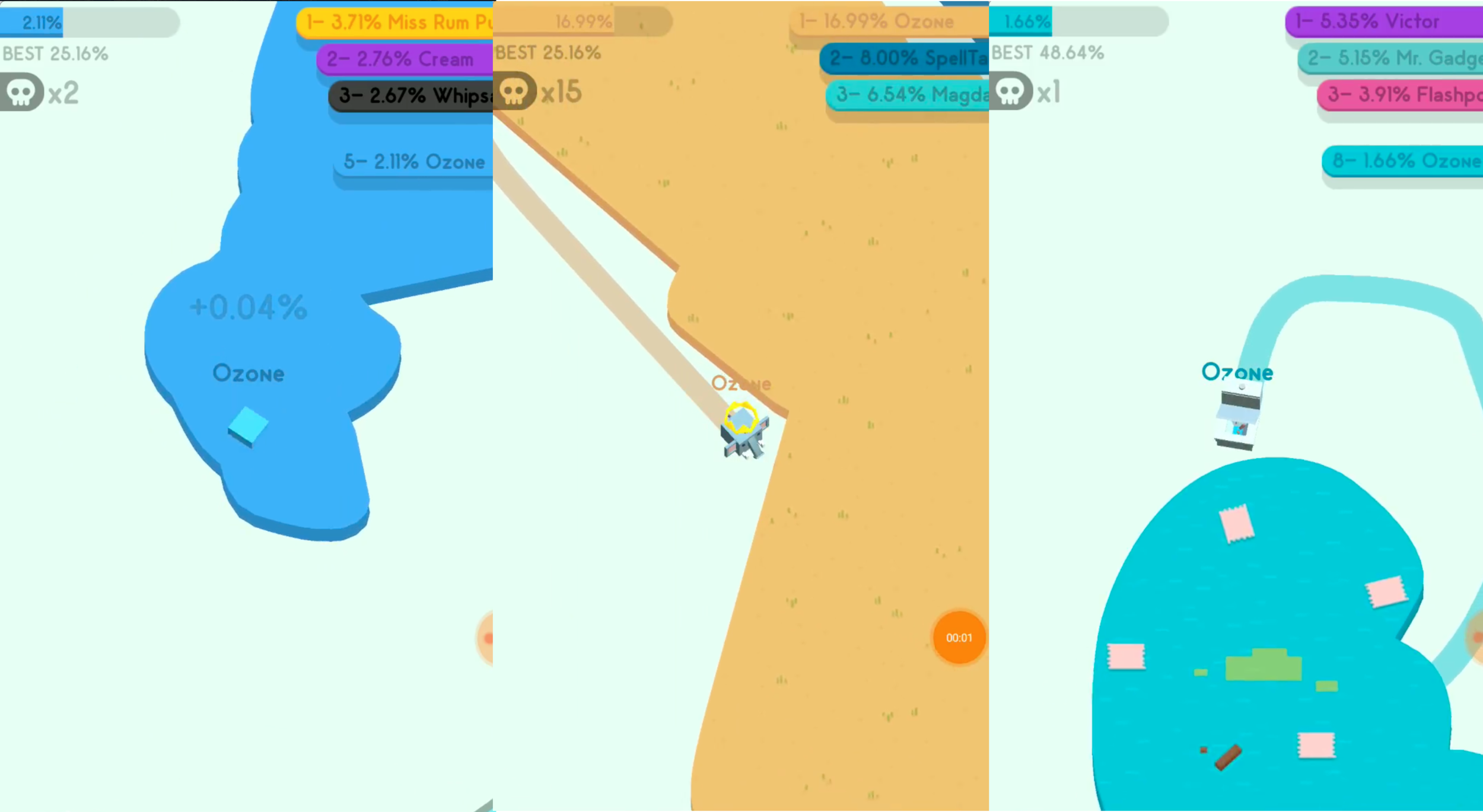
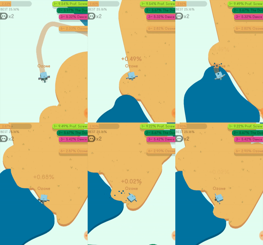
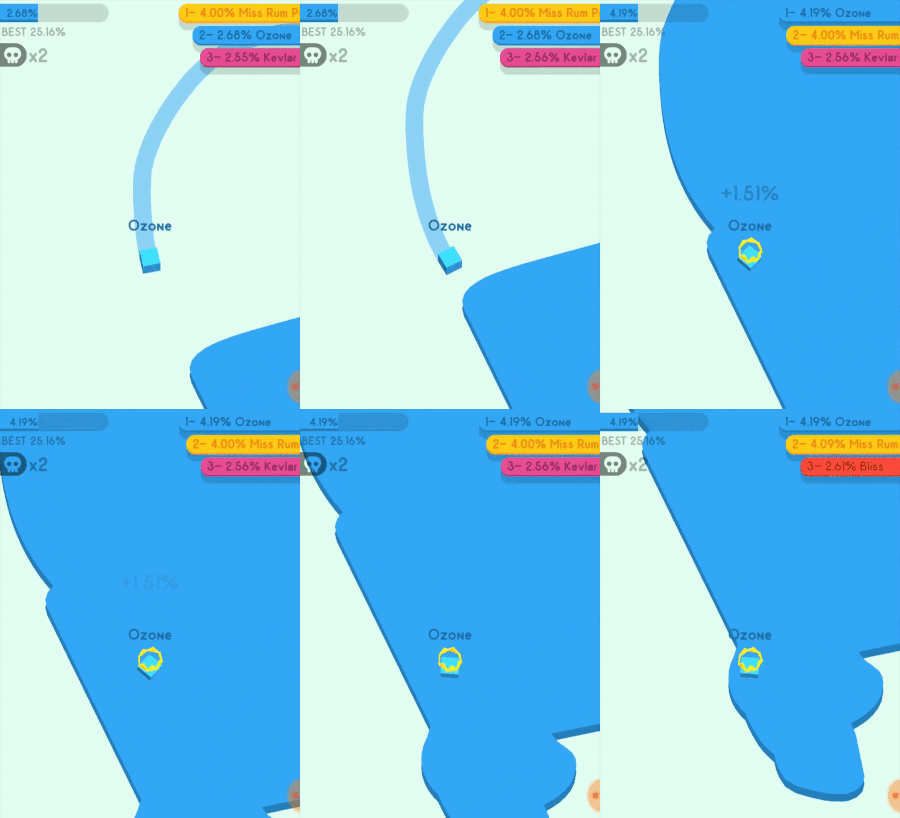
The game shows the percentage you acquired after every successful territory grab.
2. Particles shoot up when you are in someone else's territory. (see above)
3. The game has a crown on whoever has the highest percentage. AKA the king.
This may not have a gameplay affect but it can have a psychological one.
If you see the king, you are more likely to want to kill that player. If you are the king, then it feels awesome to know you are the top dog.
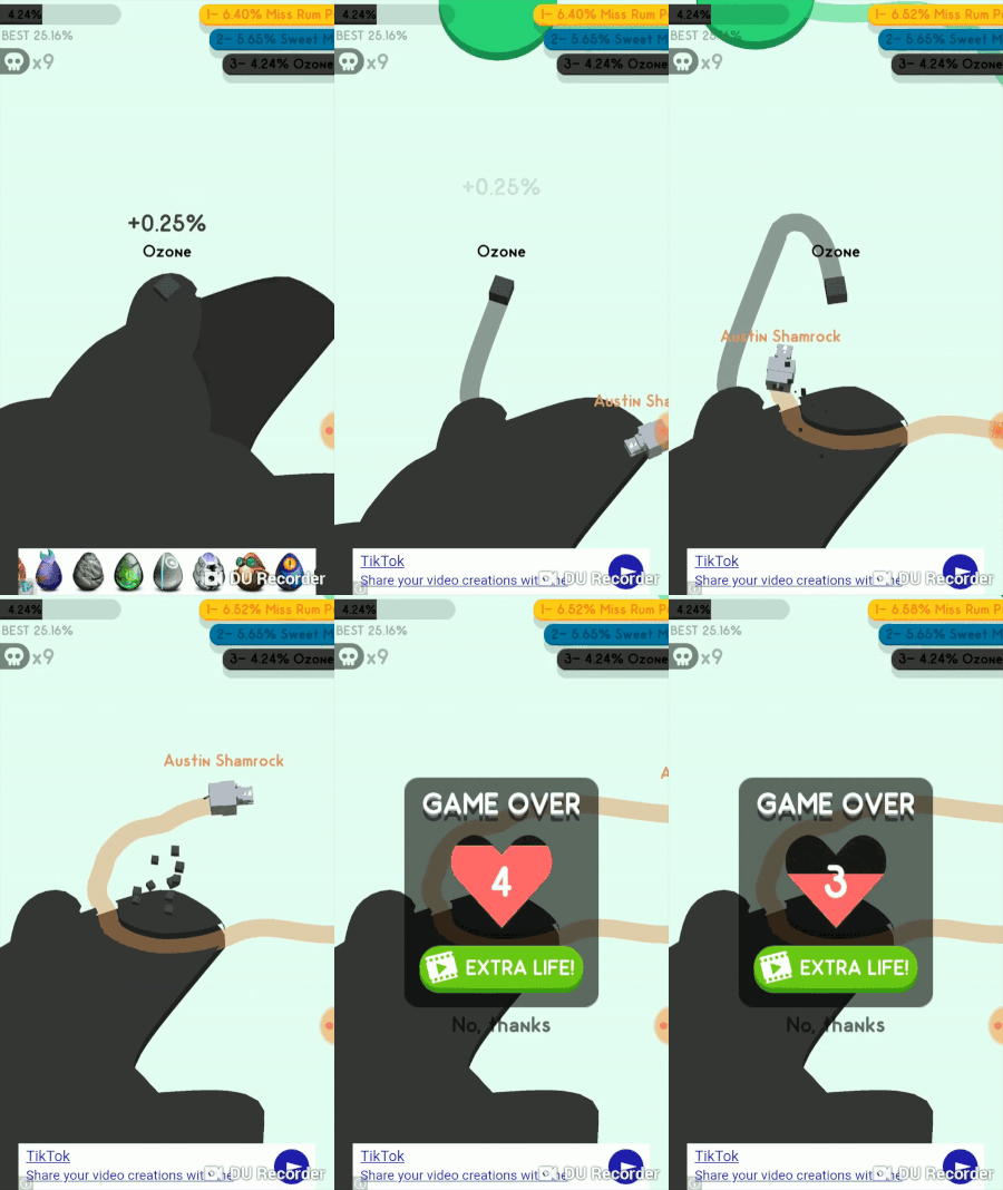
3. The death animation is a 3 step process that draws out your agony.
First your line disappears. Then you explode in a satisfying animation. Then your territory fades away.
This is all much better than everything disappearing at once. It's more satisfying to kill other players and more dreadful when you die.
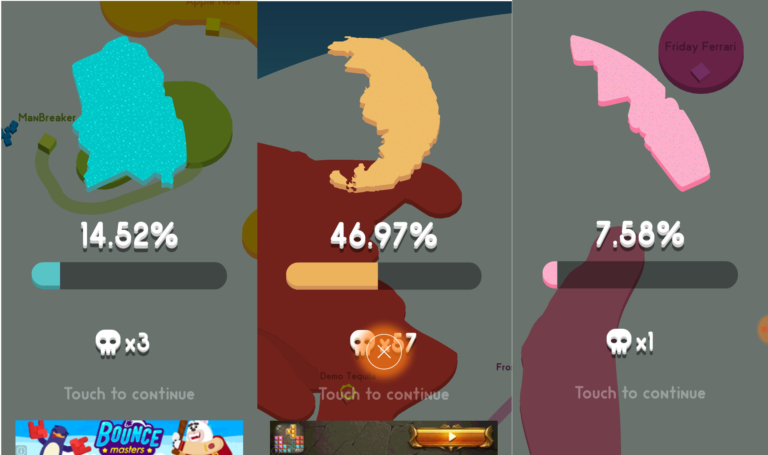
4. You are shown your territory after you die.
This is a really cool improvement from the previous title. Since you have a limited view of the game space, it's nice to get a whole screen view of the territory you conquered.
Similar Games
There are many, many io type games where you are playing against a bunch of bots or humans to become the biggest or strongest.
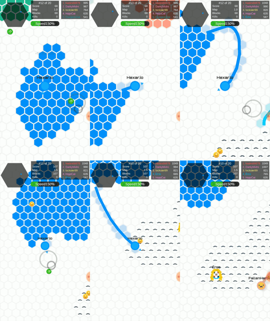
In terms of this specific io game, the most similar is String.io. It's another space taking game and has the same free form movement of this sequel. There are hex shaped spaces that you take. I assume this was probably a little easier to program than the free form shape in Paper.io 2.
Another similar game is Hexar.io, which is basically the same as string.io, but with different metagame mechanics.
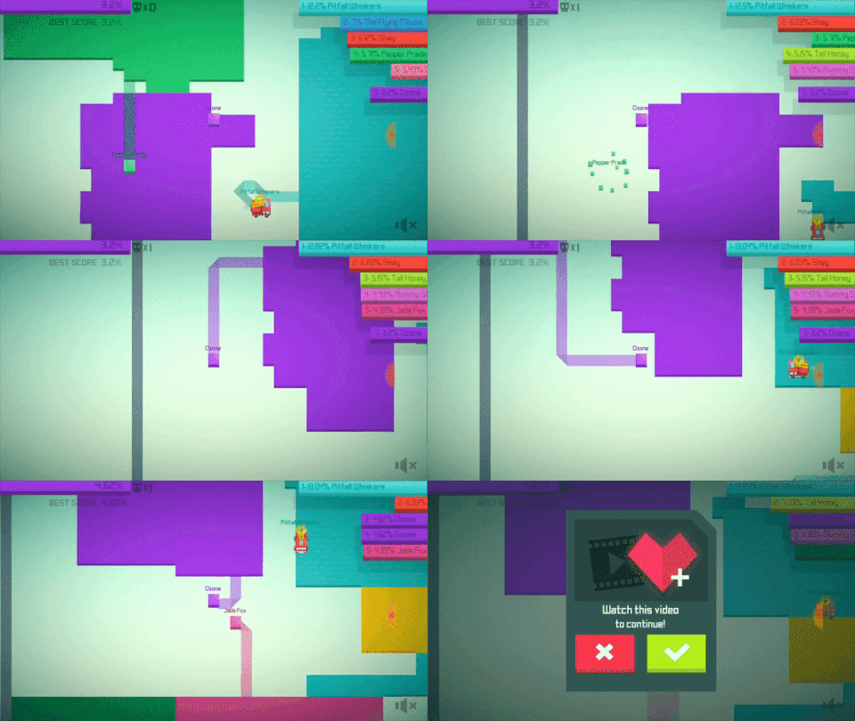
Of course, I should probably show you what the original Paper.io looked like as well.
Bugs
Not something I would normally write about but there is definitely a game breaking bug in here. There has been multiple instances where I have owned 40%+ of the arena and then suddenly I have <1%. Like someone took some of my territory and instead of taking away that small chunk, the game took away the larger area. Somehow the logic to determine which territory to take away is off.
Either way, I suddenly lost all my territory in a very not obvious manner. This deters me from continuing to play the game. Why should I keep trying to get 100% when I keep dying like this?
I caught it happening in this video. I was at 11% and then my space disappears. I did a video instead of a gif because you can hear my live reaction haha.
Conclusion
Paper.io 2 takes the classic io competitive gameplay and makes enough tweaks to the original to have a quality sequel.
For me, by far the most interesting aspect is the AI and difficulty curve.
As you conquer space, you naturally make the game more difficult for yourself. It's really quite elegant.
It's still unclear how much tweaking of bot AI and bot spawning there is. Who knows, if I was able to get to higher percentages, then maybe I would see a noticeable change.
Let me know what you thought of this write up! Would love to discuss your thoughts on the game and the design.
Cheers!
Happy Glass — Game Design Analysis
Basic Description
Happy Glass is a free physics based puzzle game by Lion Studios. A developer that has been able to put multiple games on the top charts recently.
Happy Glass has reached the top charts in both stores, peaking at #1 on the Play store’s top free games.
The objective is to guide the water into the glass by drawing lines on the screen. Every one of the 500 levels has a set of obstacles to guide the water through and eventually fill the glass. The player is then given 1–3 stars based on how much they drew (less is better).
New obstacles and game mechanics are introduced to increase level variation and difficulty.
Similar Games
Like many mobile games (fine, all games), Happy Glass takes it’s mechanics from other popular titles.
The drawing mechanic has been done many times before. In fact, Lion Studios has another physics based drawing puzzle game called Love Balls.
A game I played a lot that also falls in the drawing puzzle category is Brain It On! Each level has it’s own objective, but you are still drawing to achieve that goal.
The water mechanic has also been used in many games. Most notably in Disney’s Where’s my water? Where you guide water to help Swampy the alligator take a shower. This game has a removal mechanic instead of additive. Instead of drawing lines, you are removing dirt to help guide the water.
Game Loop
The core game loop in Happy glass is the same as other level based puzzle games.
The player is presented with a puzzle.
The player completes the puzzle.
The player is rewarded. Go to 1.
The gameplay is not infinite, it is based on a series of handmade levels.
One small tidbit I’d like to point out is that clicking start skips the level select screen and jumps straight into the level you are on. This is something I like, because they are just getting me to the game faster.
A metric I like to take a look at is the time between rounds. How fast can you go from winning one round to starting the next? Happy Glass has a quick turnaround at about 5 seconds.
Gameplay Mechanics
There are many, many different mechanics that you must puzzle your way through in Happy Glass. I’m through about the first 200 levels and here is a glimpse of what I’ve seen so far:
Immovable objects
Movable objects
Spinny thing
Hot surfaces (remove water)
Non-drawable area
Multiple glasses
Multiple spouts in multiple directions
Imagine this…but another one!
Glass direction
Metagame
A game with 500 levels has enough content to keep players hooked for a while, however, Happy Glass still has some light meta content.
The main meta mechanic is unlocking new skins. Some people might disagree that a simple skin store doesn’t qualify as a metagame, but it’s the closest thing in Happy Glass. You are still playing the core game over and over in order to complete the meta game.
There are different colors for the water, faces for the glass, and pencils for drawing.
There are 15 colors for the water at 1000 coins each.
There are 11 different faces ranging from 150 to 4000 coins.
There are 10 pencils ranging from 150 to 2000 coins.
That is a total of 36 different unlockables costing a total of 43650 coins.
Ideally, I would calculate how long it would take to unlock all of these skins, however, the coins can ONLY be obtained by watching ads or buying coins with real money. There are no coins achieved for completing levels.
To be fair, there are new challenge modes that you can acquire coins from, but the amount of coins is very low, the gameplay lacks longevity, and I’m really just focusing on the main game.
Monetization
The IAPs in this game include removing ads for $2.99, and purchasing various amounts of coins.
There is a banner ad at the bottom of the screen at all times. Interstitial ads run between levels every 2–3 or so.
There are several rewarded video ads.
On the IAP page, you can watch an ad for 100 coins. This seems to be an infinite use item.
When you finish a level there are multiple things that could happen. If you don’t get 3 stars, you have the option to watch an ad to get that third star.
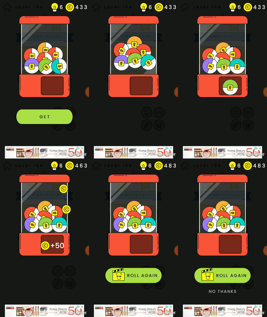
If you do finish with 3 stars, then you can watch an ad for a random reward. There are multiple chance based reward games in Happy Glass.
3. There is a spin the wheel type game.
4. There is a random prize machine game.
Both will give you a random amount of coins between 25 and 250. You can also earn light bulbs which are used for in game hints.
5. Occasionally when you finish a level, you can watch an ad to get one of the expensive skins for free. Wow! That’s a 2000 coin value! Just for ONE ad?? /s
Of course, the random games are probably weighted so that you are more likely to get the lower prizes than the big jackpots.
There could also be some unknown conditions that trigger the free skin prize. A theory of mine is that they give this option to you if you have resisted the other rewarded ads. But it could also just be a 1/10 kind of thing.
I would love to find out, but I’m not going to watch a bunch of ads to figure out the prize probability.
Game Length
The game’s length comes down to how long it takes you to finish all 500 levels and if you want to get all 3 stars or not.
I ran 2 tests timing how long it took me to play 10 levels. Test #1 took 5 minutes, or 30 seconds per level. I did not get stuck on any levels.
Test #2 took 10 minutes, or 1 minute per level. This time around I did get stuck on a couple levels.
I’m going to take the average here and extrapolate to come up with a very rough estimate for how long it would take to complete the game.
7.5 min (for 10 games) * 50 (to equal 500 levels) = 375 minutes or 6.25 hours.
Considering I only play any given mobile game for 5–10 minutes at a time, this game will last me a while (assuming I don’t get bored first).
I don’t factor the skins in the length because I don’t have the average coin output per ad watched.
Game Juice
I like to take a look at the game’s ‘juice’, also referred to as game feel or game responsiveness.
These are things like animations and sound effects that occur when the player interacts with the game in a certain way that makes the game ‘feel’ good.
Happy Glass covers the basics like button movement when you tap and coins physically moving to your counter.
Juice that is unique to Happy Glass is that the pencil waves back and forth when you are drawing.
Another cool piece of juice is that the face changes depending on how much water is inside of it. No water produces a frowny face, some water produces an ‘O’ face, and a filled glass produces… wait for it…. a HAPPY face.
Conclusion
Happy Glass merges the drawing and water mechanics in a simple yet fun puzzle game. The shear amount of levels keep this game playable for hours.
I would have liked to see an in game way to get coins. Achieving the skins ONLY through ads or IAPs rubs me the wrong way. However, since they are only skins, it’s something I can live with.
You can download Happy Glass for free on iOS and Android today.


