Catch Phrase Against Humanity Name Change Announcement

Below is a post about Catch Phrase Against Humanity, the first game I ever published, and why I have to change the name.

It's amazing to see how far Catch Phrase Against Humanity (CPAH) has come. It was a game I prototyped at a cabin in Tahoe 3 years ago and now is played daily around the world.

It was the game that propelled me into the gaming industry. After CPAH, I published 3 other titles and got a job as a Software Engineer at Jam City. I had a dream and CPAH was pivotal in making it a reality.

I would like to share some metrics that I'm really proud of and that you might find interesting:

  • The game has been downloaded 100,000 times

    • (Since CPAH is a party game, I estimate the total unique player count to be close to 1 million)

  • There have been 1.7 Million rounds played

  • The average # of rounds per play session is 13

  • The user base is 60% female and 40% male

  • The game has been downloaded in 100 countries

I never expected my first game to reach these kinds of numbers.

However, with all these accolades comes some unfortunate news.

I have been talking with the folks at Cards Against Humanity and we have agreed that I should change the name of my game to better differentiate our brands.

When I originally released CPAH, people told me this might happen. My response was always that if this were to occur, then it's a sign that the game is successful. Well, that's exactly what happened.

While a name change is suboptimal, this post is not meant to put down my fellow game developers at Cards Against Humanity. Instead, it's meant to announce the name change and reflect at the 3 year history of the game.

In January, I will push an update that will officially change the name of Catch Phrase Against Humanity to: Catch Phrase for Adults.

It's rather simple, I know. While I love getting name suggestions from you all, part of the success of CPAH has come from ASO (App Store Optimization) and searchability.

I'm planning on making a few other updates to the game along with the name change. Looking at the current codebase makes me cringe a bit. I now have the skills to build a much more robust app that will persist for many years to come.

Thank you to everyone that has played any of my games. It really means a lot!

Cheers,

Olin
PAX East Kicked My Butt

PAX was exhausting. It was an expensive trip to learn that I’m a small fish in a big pond. On the bright side, I’m more motivated than ever to make a name for myself in this unforgiving industry.

But before we get into that….

What is this PAX thing you speak of?

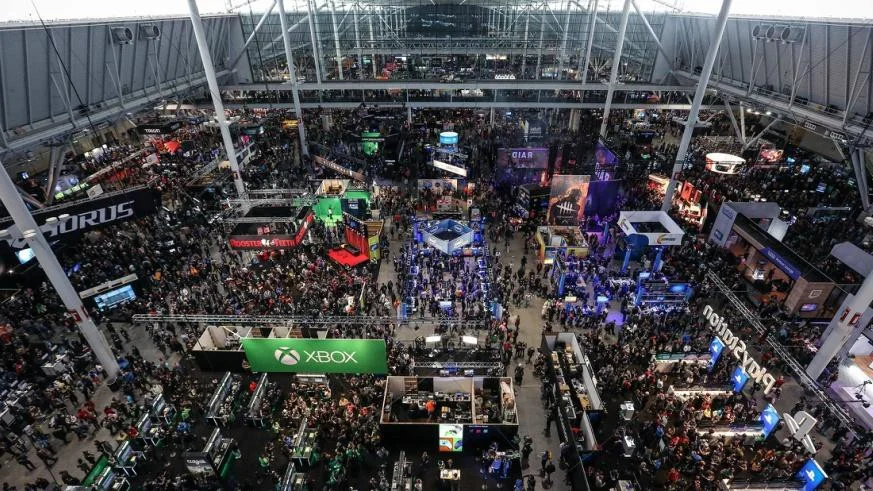
Ok, let’s start with the basics. PAX — Penny Arcade Expo — is one of the largest consumer facing video game expos in the world. It’s where gamers go to play the latest and greatest games. There are 4 PAX Events throughout the US and Australia. PAX East is held in Boston.

Pax East 2018 from above

Pax East 2018 from above

This differs from E3 — Electronic Entertainment Expo — which is mainly for video game press, GDC — Game Developers Conference — which is for people making games and Comic-Con which includes more geek culture than just video games.

At PAX, companies set up booths for gamers to play games at, people give talks about gaming, and cosplayers entertain everyone by dressing up.

Team Fortress 2 Cosplay at PAX

Team Fortress 2 Cosplay at PAX

My History at PAX

I have been to PAX West in Seattle 8 times. Every single time I went as a gamer looking at all the cool games. Most of those times I didn’t even know how to code.

My favorite was always the indie game section. Indie meaning independent, generally smaller, video game making studios.

Indies are known to have the most innovative games. Creativity and the love of the craft trump the business’ bottom line. The cool part about these booths is that the creator of the game is likely watching you play and open to conversation. The AAA titles, like Call of Duty, Zelda, and Final Fantasy, interest me less. Not only could you stand in line for 1–4 hours, but you are alone while playing, unable to ask questions about the development process.

Fast forward to PAX East 2018 in Boston and I am holding my first ever Exhibitor badge! Something I have dreamed about for a long time. Walking around the crowd of 80,000 with this special badge gave me a sense of pride that I was invited because I created something.

The Main Event — So what did I actually do for 4 whole days??

I had my own booth, a 3' diameter table to be exact, in which to display my game. I was with 5 other developers sharing a larger space.

Olin and Cameron at the Bunny Blocker booth

Olin and Cameron at the Bunny Blocker booth

I had a monitor, raised above peoples heads, showing gameplay footage of Bunny Blocker. I had 2 iPads mounted on stands for people to play the game. There were business cards, stickers, and cozies that people could take after playing the game.

Getting people to play the game was not too difficult. Tons of people would watch the gameplay on the monitor for a few seconds and then go up to an iPad and start playing. Some people really just want to play, while others wanted to ask me questions.

I was with my friend Cameron, who did the music for the game, so we were able to switch off holding down the booth while the other got food, walked around, etc.

So what did I get out of it?

I had tons of people play the game and met a lot of people in the industry. Here’s a short list:

  • Tons of feedback about the game — I’m working on updates based on the feedback

  • Networking with other devs, talking about the development process, and connecting online

  • Being there in the expo hall with other members of the industry just felt right

The overall response to the game was extremely positive! Many people were shocked that I did all the design and programming by myself in only 9 months. Some people congratulated me and shook my hand and I even had someone ask for my autograph.


One of the things I didn’t anticipate was how well I would fit in with the rest of the people in the industry. I was talking the same talk and showing an impressive game. It reinforced my thoughts on choosing to go down this path since I had spent most of the past couple years coding alone in my apartment.

Now, I’m not going to say everything went perfectly. There were some things that could have gone better or just weren’t meant to be:

  • Press attention was not super great

  • A better booth setup could have attracted more people

  • More networking — not that I didn’t do a lot, but because I can always do more!

This was not a press centered event, so maybe I was just expecting too much. I don’t think I will be featured on any major websites nor will any famous youtubers be playing my game. However, the few members of the press I did talk to genuinely enjoyed the game and put a small write up or image on their indie game focused website.

pax5.png


I think one of the biggest takeaways was from something that happened on Saturday. I was walking around the expo hall looking at games and thinking, damn, all of these games are way too good. Their teams are bigger, they have better presentation, and they are doing things I don’t know how to do. It was getting me down.

In that moment, I thought that maybe I wasn’t cut out for this.

Later that night, my cousin Jacob said something to me. I had told him about all the other games that were there. The really, really good games. Before I could get to my negative reaction, he said something like, “are you motivated by that?” In my head the answer was no, I wasn’t. I was sleep deprived, hungover, tired, and part of me wanted to give up.

But when he said that, I realized the mistakes I was telling myself. My exhausted mind was convincing me that it was too much and that I couldn’t do it.

In that moment, I shifted my mindset from “I can’t” to “I can”.

It’s ok that I don’t know how to do everything right now because I can learn. It’s ok that my presentation isn’t the best right now because it can get better. The fact that I was at that event, at my age, with a high quality product of my own is an incredible feat. I can figure out how to improve. I can always get better.

Sometimes you look at something and think, I have no idea how they did that or wow I could never be that good. I now look at the other games and think, I can do that, I can be that good. And if I don’t know how, I’ll figure it out.

That’s enough about my deeper motivational aspirations. For more on that, check out this blog post.

If you’d like to learn more about my current project, check out Bunny Blocker. I also have a website with all the Lit A.F. Games projects.

Cheers,

Olin Olmstead

Lit A.F. Games — Owner, Programmer, and Game Designer

Catch Phrase Against Humanity’s Freemium Model

free games.jpg

The freemium model dominates app stores. My games are no exception.

I have been listening to a book on Audible called "FREE: The Future of a Radical Price" by Chris Anderson. In it, he talks about the history of free and how that price affects certain economies. He describes how people react differently to a cost of $0.01 versus free. He talks about how people value objects differently when they pay for them versus when they are free. He talks about Moore's Law and how certain things (like digital storage capacity) double in size and halve in cost every 18 months.

These topics reminded me of how I sell my mobile games. I'm sure you have all heard of the freemium model: offer a product for free but have advertisements and paid premium features.

So why have this model? The main reason is to reach more people. More people will download an app or a game if it is free. Would you download an app for $0.99 when there is a free one that does the same thing? $0.99 is almost nothing, yet we will avoid it if we can.

free_vs_paid_apps.png

Catch Phrase Against Humanity currently has over 7k downloads. It would be a fraction of that without a free price tag.

Income is generated from ~5% of people that pay $2.99 for the premium version. That premium version removes ads, enables a new game mode, and allows for more custom phrases.

The players who paid nothing still generate income from ads. I get anywhere from $1-$3 per thousand views of the ads. There is a banner ad at the top of the screen and then a full page ad that pops up after every other round.

I don't get to keep all of this money. Apple and Google take 30% off the top. Does this seem like a lot? Think about what features they provide that justifies their cut. I get access to every single person with a smart phone in the world. A market of billions of people. If I can stand out from all the other apps and games, then people will find me.

As of this writing, if you search "Catch Phrase" on Google Play and the iOS App Store, my app shows up 4th. That is pretty good, and probably a large reason for the downloads.

I plan to use a similar freemium model for my upcoming action puzzle game, code named "Move the Blocks". There will be ads and a premium mode but how these are structured will be slightly different.

Ad placement is about trying to show as many ads as possible, while not intruding on the game experience. In Move the Blocks, the screen real estate is too valuable to have a banner ad; as in, there is information I need to provide to the player on all screen edges.

There will be a full page ad that pops up every 3 levels or so. Each level could last 10 seconds, or it could take the player a few minutes. In this case, I could also base it on time. If one level is taking the player a long time, then I could show an ad directly after they complete it. I could also factor in level retries. If they fail a level 5 times in a row, then I show an ad. That begs the question: if a player is struggling with a level, do I really want to punish them with an ad? That is the kind of balancing I need to get right.

There will then be a premium version of the game that players can upgrade to. The upgrade will remove ads and unlock more levels. The key here is to give the player just enough gameplay that they want to continue playing more levels by buying the premium version.

This model is definitely the way to go as I keep making small mobile games. If I move into the PC gaming market, then I will adapt to the best pricing model on that platform. For now, everyone can enjoy my games for free.

Early Feedback Proves Valuable Again - Update #2

mobile_testers.jpg

I completed another iteration to my upcoming action puzzle game, codenamed "Move the Blocks".

This is the 2nd playable version and includes input from feedback I got from the first round of testers. The big takeaways were to utilize more player feedback and to change up level progression.

Player Feedback

To be clear, this is my definition of player feedback: any visual or audio response when the player interacts with the game.

I went on a Youtube binge of videos about player feedback, also commonly called "game feel" or "juice". Basically, the little things in a game that make your game feel good to play but don't necessarily add to the game play. These are things like an animation when the player kills an enemy, or particles that shoot out when you do something good. It is a vast array of things that make the game responsive and "fun".

It might not make sense to add juice to a puzzle game, but just look at a game like Candy Crush. Yes, Candy Crush is a puzzle game and yes, it has lots of juice to keep players coming back. Most of my juice was different animations and movements. Audio is something I still haven't introduced yet.

This is a list of some of the improvements:

  • The dashes along the perimeter now disappear when the ball moves over them. It's kind of like a Pac-man type visual and adds to the goal of getting the ball to the end.

  • Time rewinds after death instead of just teleporting everything back to its starting position. Blocks move back to where they started, the ball retraces its steps, and the dashes that disappeared now reappear.

  • The blocks grow and shrink when moving them to add a sense of weight.

  • I added more tweening animations to almost everything. The dashes don't disappear, they shrink out of sight. The levels don’t appear and disappear, they slide in from the left and out to the right.

  • When blocks hit each other, they change colors.

  • Particle effects when the bonus coin is collected or the level is completed

All of these may not seem like a big deal and will go mostly unnoticed. But without them there, the game can feel stale and unpolished.

Level Design

Level design improved a lot as well. I took the 10 existing levels and added an additional 20. Each section is split into 10 levels called a "level set". Each one has similar gameplay elements. Each level flows into the next as you complete the previous one. After all 10 levels in the set have been completed, your death and bonus coin stats are displayed.

One major gameplay element that I added were blocks that you can't move, but that the ball can go through. Basically it blocks passage for the blocks on the edge of the game area.

I then gave this new version to a few more friends for testing and more feedback.

The first and most frustrating thing for players was that they had trouble touching and moving the blocks. They thought they were touching the block but the game didn't register the touch. I am using Unity's built-in system for handling touch. The fix I made was making the "touch box" bigger on all the blocks.

The next complaint was that there is no way to control the pace of the game. As soon as you die, the level restarts. The players felt stressed when they died a bunch of times while they were just trying to figure out the puzzle. I will implement some sort of pause into the game. Whether that's just a basic pause button or something else is yet to be determined.

The next thing is making the bonus coins more desirable. There really isn't a use for them other than adding difficulty. Constantly showing whether they have gotten the bonus in this level and making the coin stand out more are a few ideas that come to mind. Of course you need to be able to use the coins you have collected to buy something. What that is and what the store looks like is still unknown.

The first level is also still confusing players. I originally didn't want to have a tutorial,  but instead have players figure out the game on their own. To a certain degree, that is actually working. No players need further explanation to finish the game. They just don't like to feel flustered or confused, even if it's just for a split second. I'm thinking of adding some sort of quick image at the beginning of the first level.

The last thing is how the levels are laid out. There are 10 levels in a set and players were complaining that it's too hard to go back and replay one if they didn't get the bonus or want to play it again with less deaths. The concept of level sets is not perfect yet. Think of it like a golf video game, you can't just play an individual hole, you have to play the whole 9 or 18. I think the first step is to bring down the set count to about 4 or 5. Then maybe add a way to play individual levels. I just like the way the game flows from one level to the next. I don't want a level end screen after each level that may only last 10 seconds.

There were a few levels that were a bit too difficult for players. It is hard for me to know how difficult a level really is since I am the creator of the puzzles. It's pretty easy to either make the level slower or take the complexity down a bit.

Iterations will keep happening

It has been incredibly valuable to watch other people interact with these versions of the game. There is constantly something to work on and the game is improving because of it.

Let me know if you want to test the game out! Preferably I would like to be there so I can watch, but I will also have a beta ready soon.

If you've made it to the end, thanks again for reading this blog and supporting me! It means a lot. See you next time.

Cheers

Building a Minimum Viable Game for Early Testing

Early testing fixes problems that would be a behemoth to tackle later in the development cycle.

I had to expose my early builds to people for criticism in order to achieve this benefit. I gave it to a few friends, didn't say anything, and just observed.

I did my first round of testing with "Move the Blocks", aka MTB (just a placeholder name), as soon as I had a playable demo of the game.

For background, MTB is a casual action puzzle game where the objective is to move obstacles out of the way of a ball circumnavigating the screen.


Building the Minimum Viable Game

Like a minimum viable product, a minimum viable game lets you iterate and adapt your game for greater success.

Game Mechanics

First, I got the basic rules and game mechanics working.

For MTB, that includes being able to move the blocks around by tapping and dragging on the screen. The other main mechanic is seeing the ball circumnavigate the screen and start over whenever the ball collides with anything.

Art

The assets are all currently just "Programmer art" (stand in art if you don’t have the real thing). It conveys basic visual cues. For example, there are some blocks that you can move freely and others that only move horizontally. Horizontal blocks have horizontal stripes to convey the movement pattern to the player. This won't be the final art in the game, but a similar visual cue  will exist.

Level Design

I then designed levels and built in player progression. I completed 10 levels before I handed it over to testers. Each level doesn't necessarily get harder, but it might teach the player a new mechanic or add difficulty to what the player already knows. 10 may sound like a lot, but each level in MTB lasts about 10 seconds (without dying of course).

Testing the Game

I gave it to a few friends to test out. Without explaining any of the rules, I asked them to try out this "action puzzle game" I was working on. I wanted the game to be straightforward enough from the user interface and game design that even a few short instructions were not needed to play.

The testers were not necessarily gamers, and even if they did game, they don’t play casual puzzle games frequently. I want the game to be playable for everyone, so they did just fine.

What I learned

Everyone eventually got through to the end of the 10 levels. No one struggled extremely hard and no one got through without dying at least a few times.

There were still many aspects that needed improving.

The first level is extremely simple, as in, you can't lose simple. But people were confused about what the goal even was. My next iteration will have a different level 1.

There needs to be more feedback when the player dies and when the player collects a coin. The coin is just a bonus objective for the level and acts as the currency for the game. People were confusing it with the ultimate goal and didn't even see their money count go up after they collected it. 

Graphic and audio cues will help with player feedback when they collect a coin or die. For example, I can add sounds and particle effects when they collect a coin or flash a death symbol upon death.

I also realized that I was introducing too many mechanics too early. I wanted every new level to introduce something new. For a game where each level is no more than 10 seconds long, that can be a little much. Having levels that get players use to existing mechanics will help with practice for tougher parts of the game.

For level progression, I want to reorganize the first 10 levels and then get to a total level count of 20. Constantly iterating and improving player progression will help get new players skilled at the game. The less frustration for new players, the more likely they are to get hooked.

Lastly, getting non-programmer graphics, music, and sound effects always loom ahead. Ideally those would evolve along with the game. For now those will have to wait.

This Minimum Viable Game idea has already given me things to work on. I look forward to the next iteration I can show people.